
I wanted to rework my portfolio, not only with newer projects, but also a simpler layout than I had previously had. This was a project without any hard deadlines, which meant that it of course evolved a bit more and I wound of creating a personal branding package for me and my work.
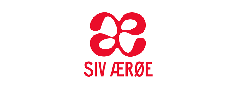
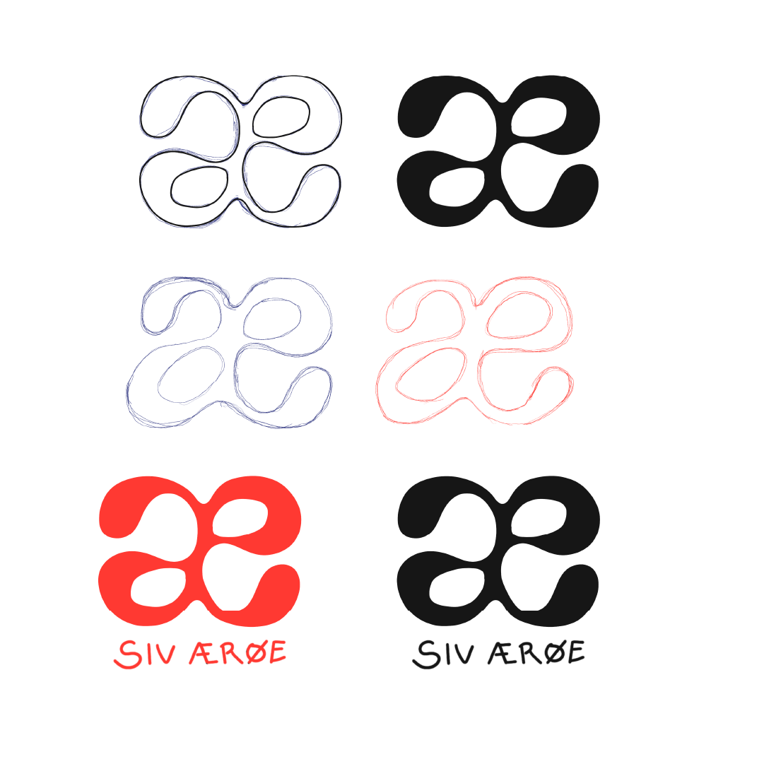
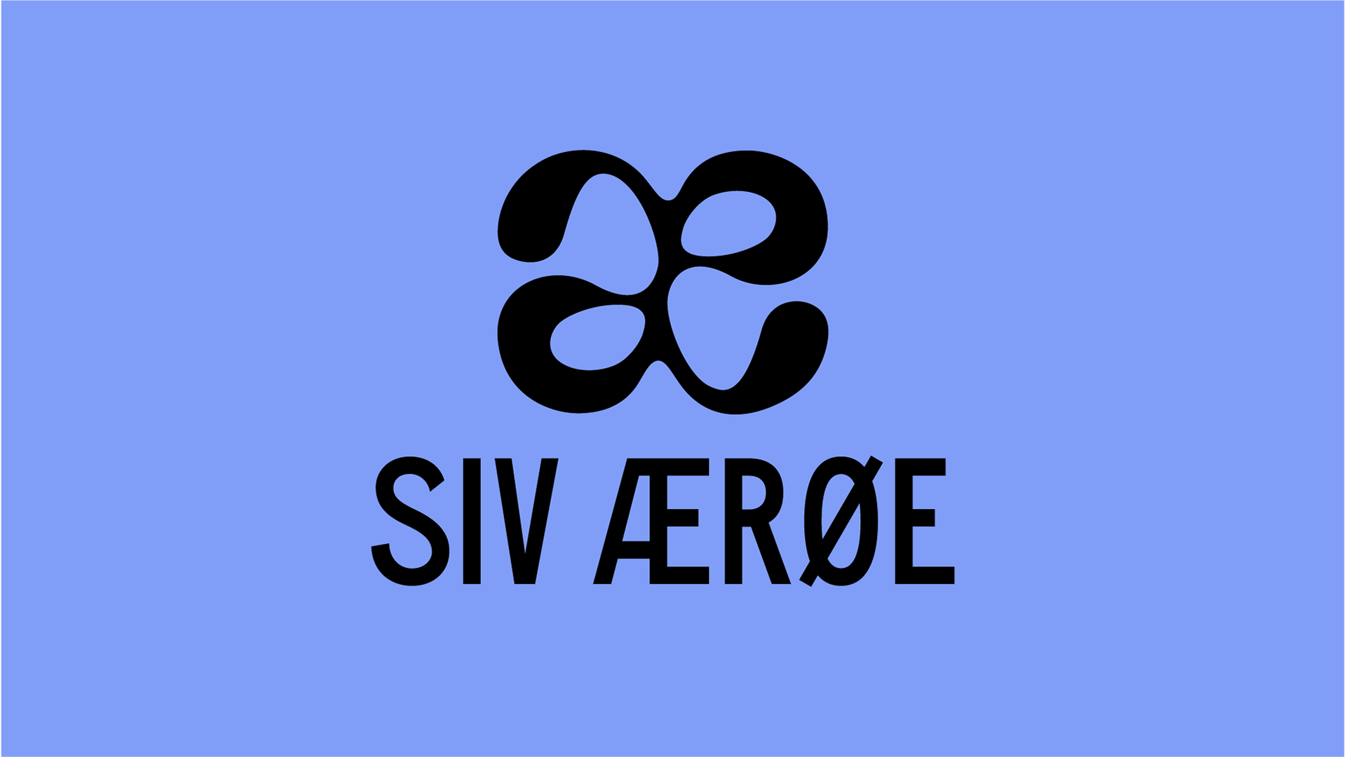
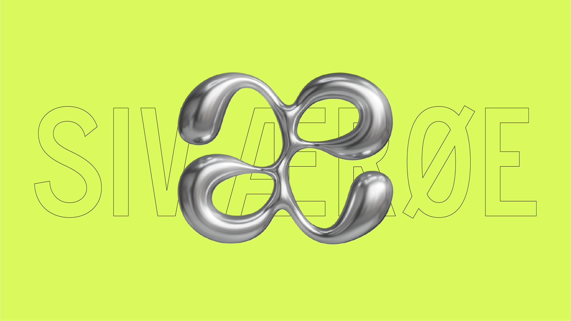
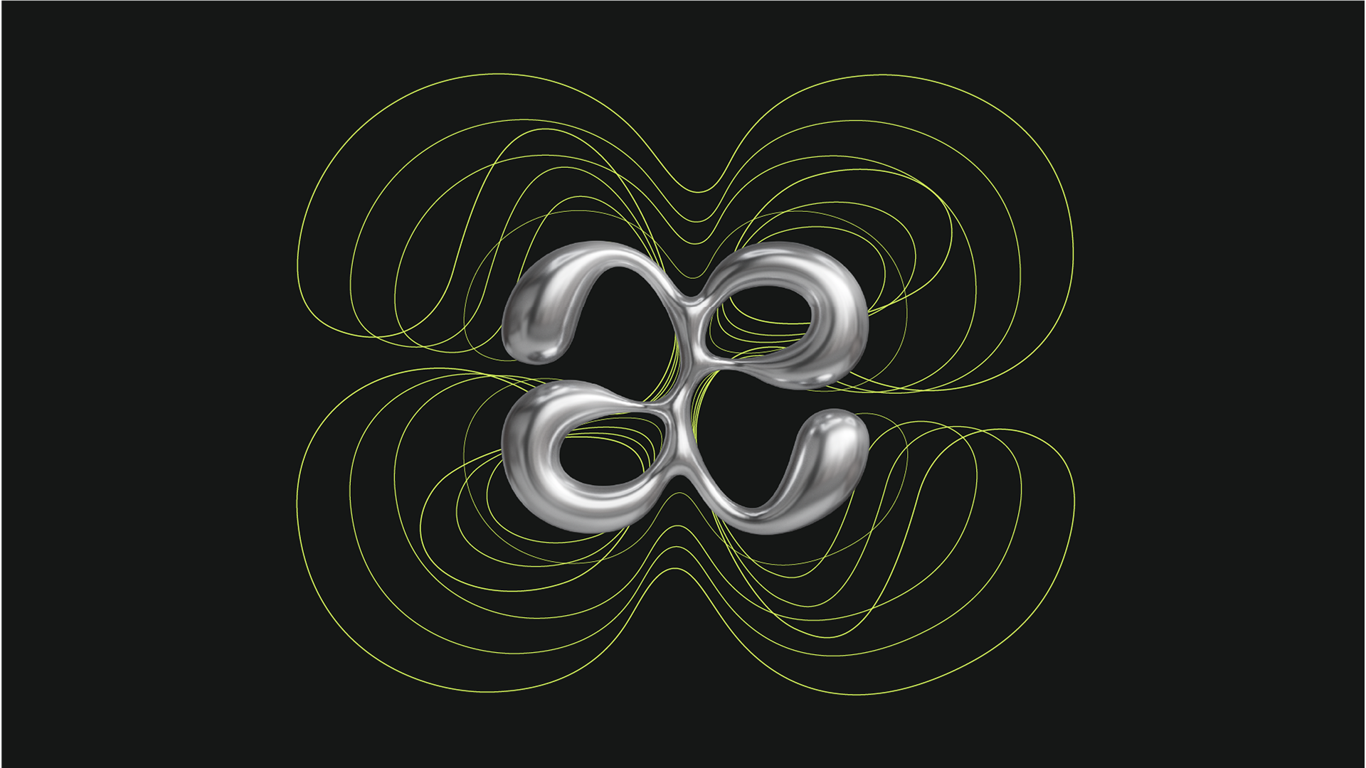
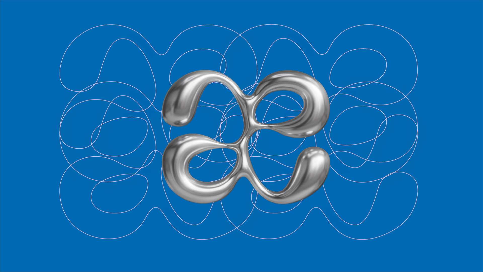
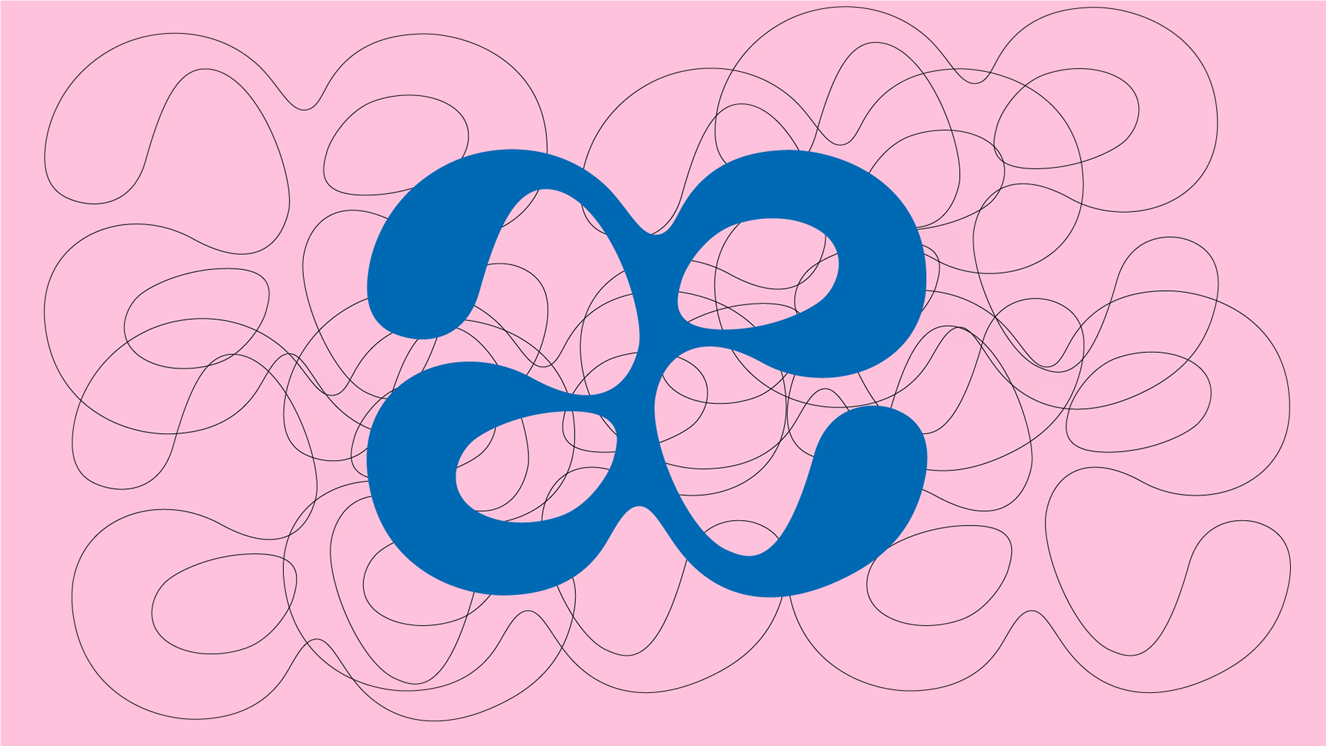
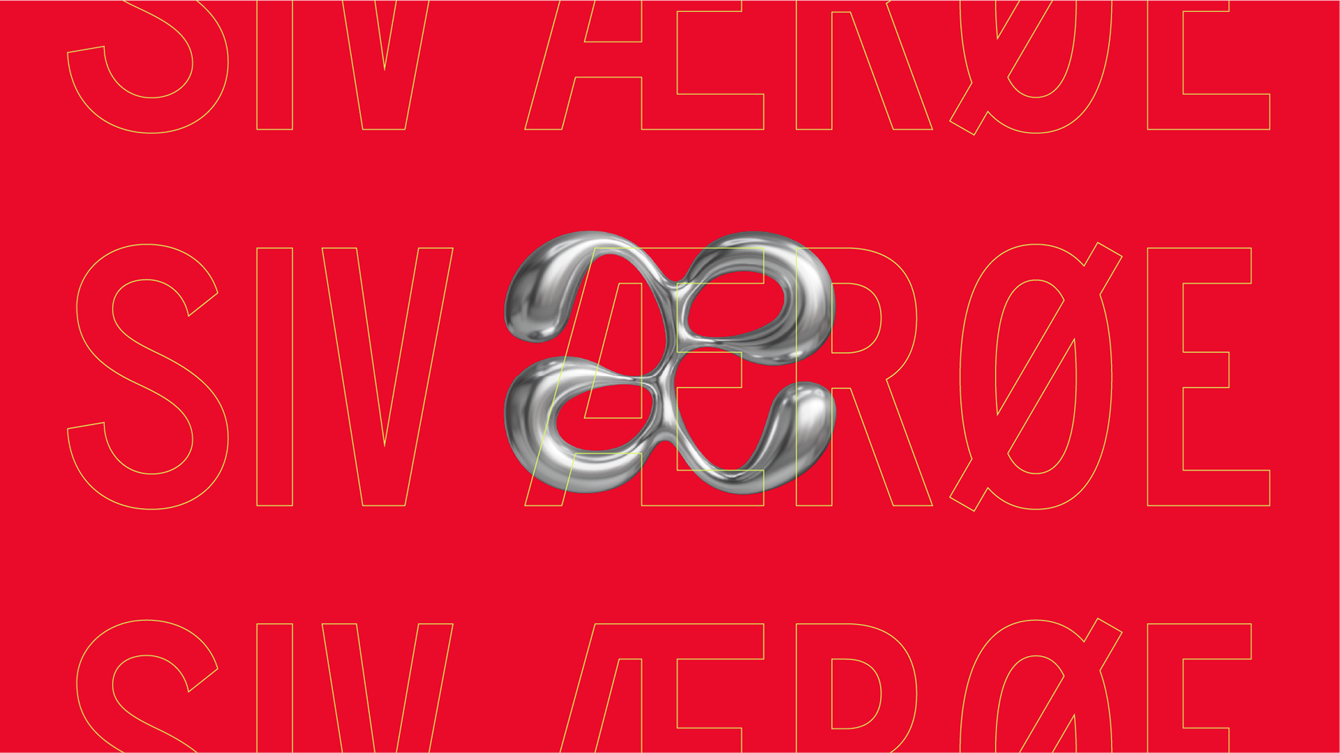
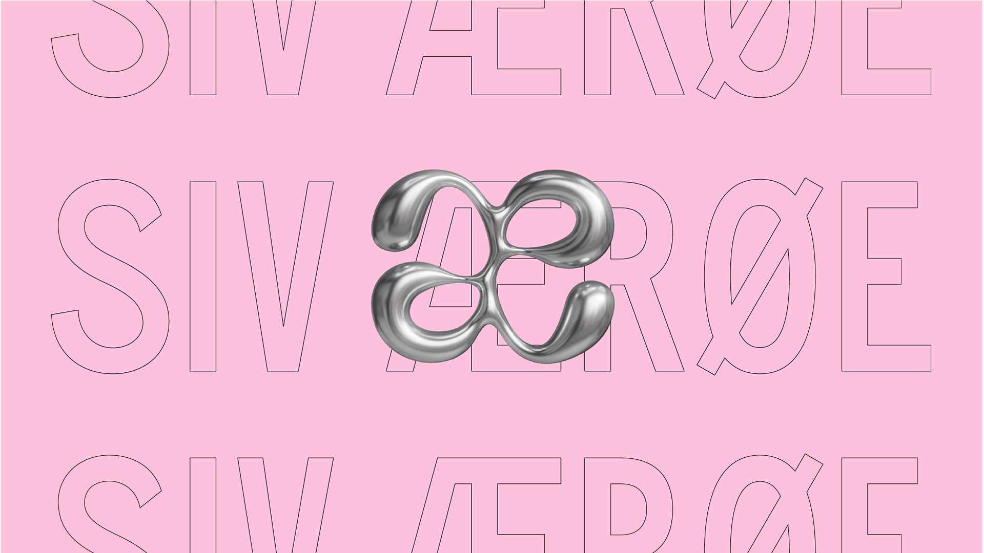
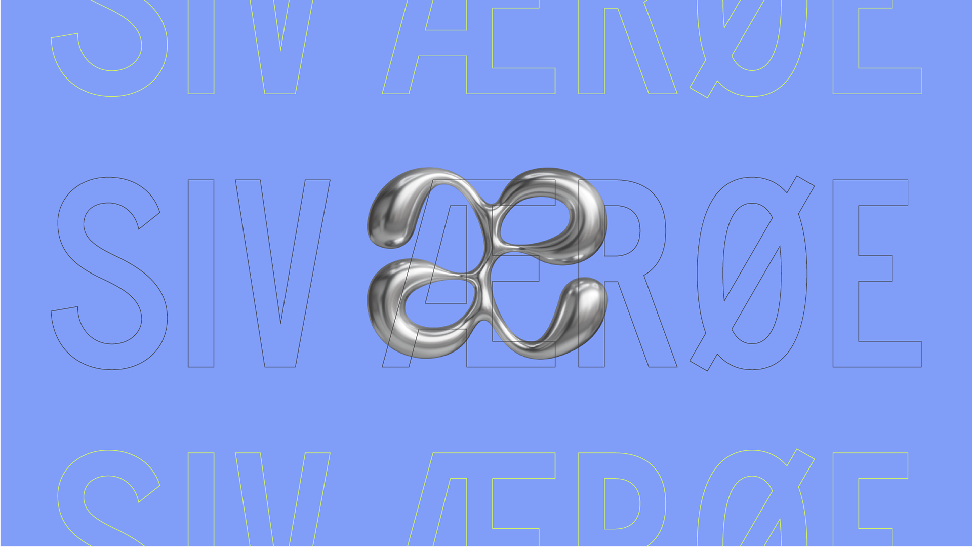
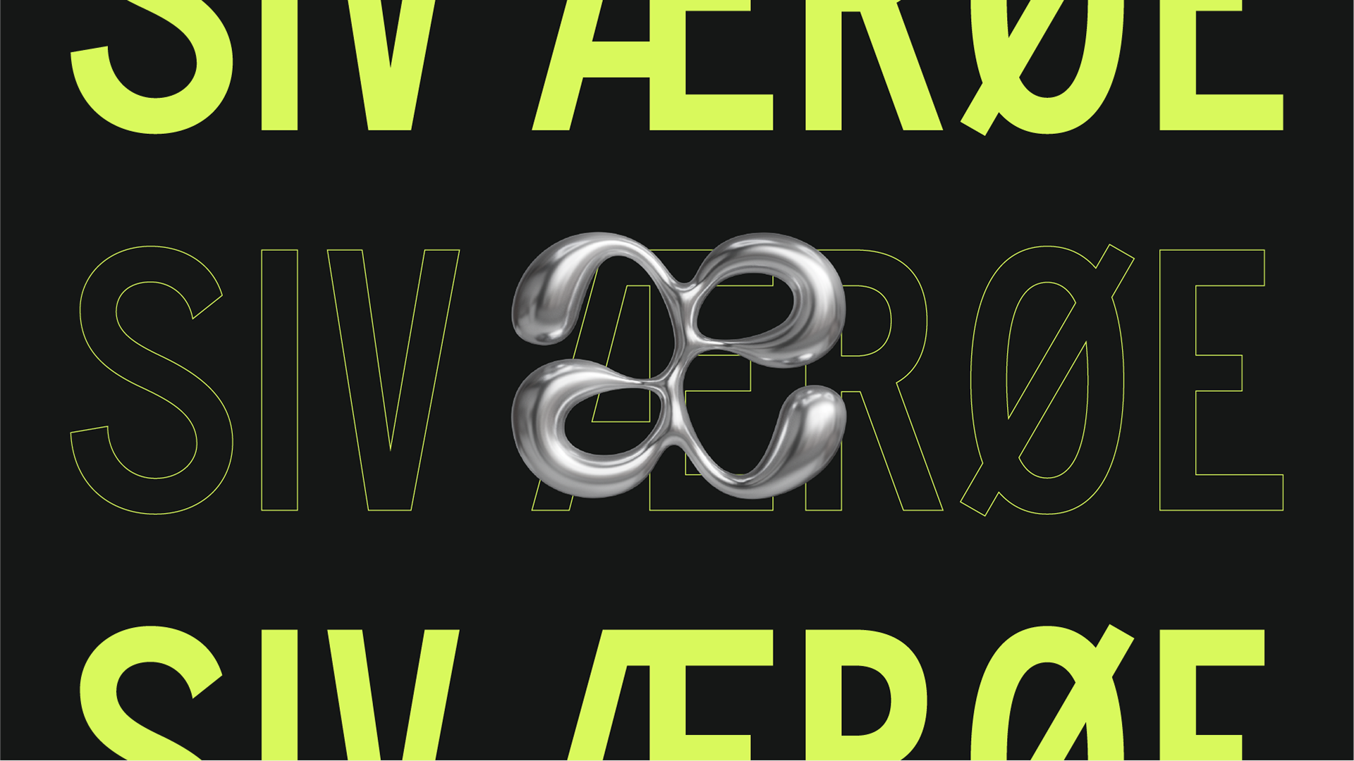
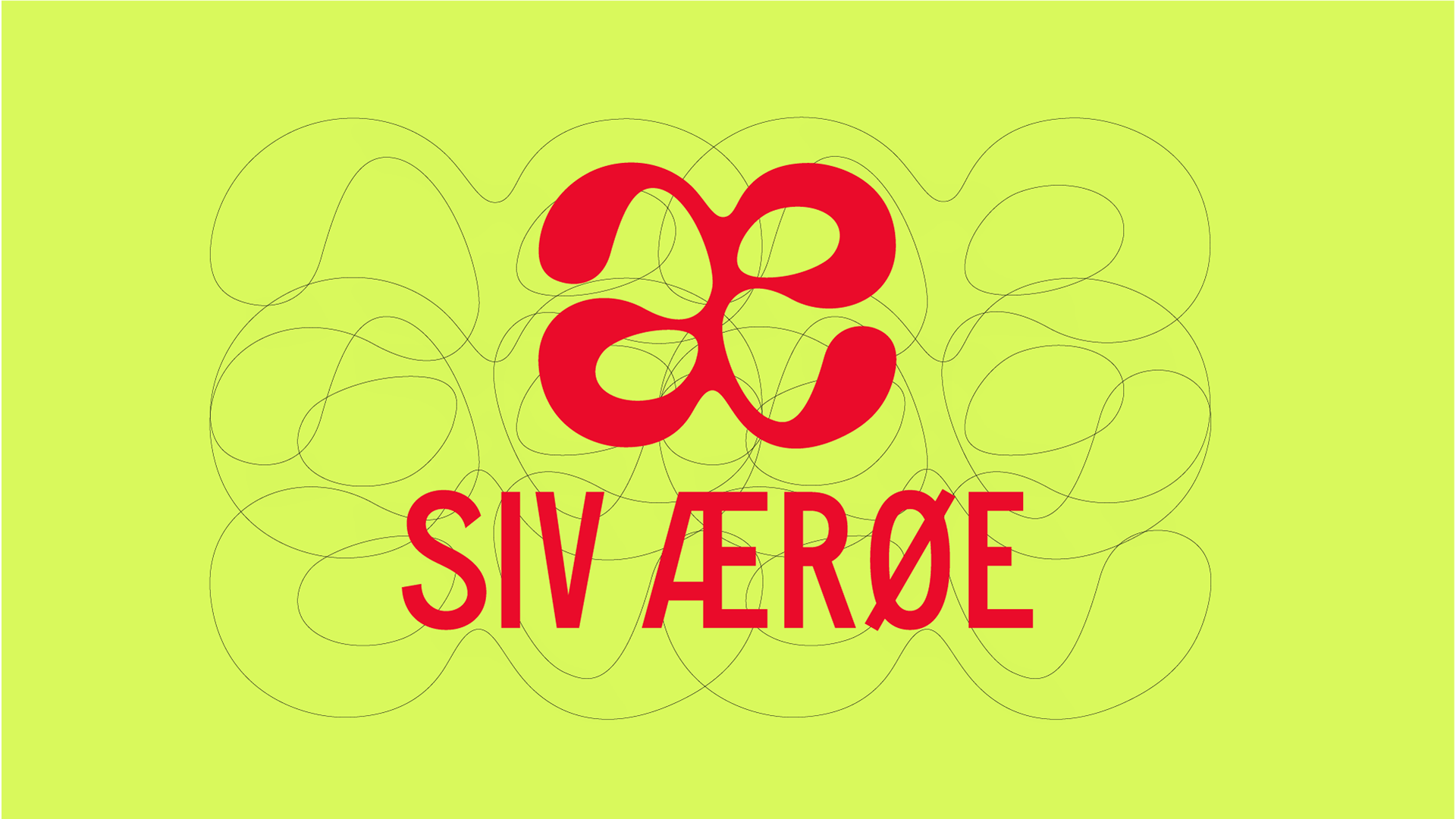
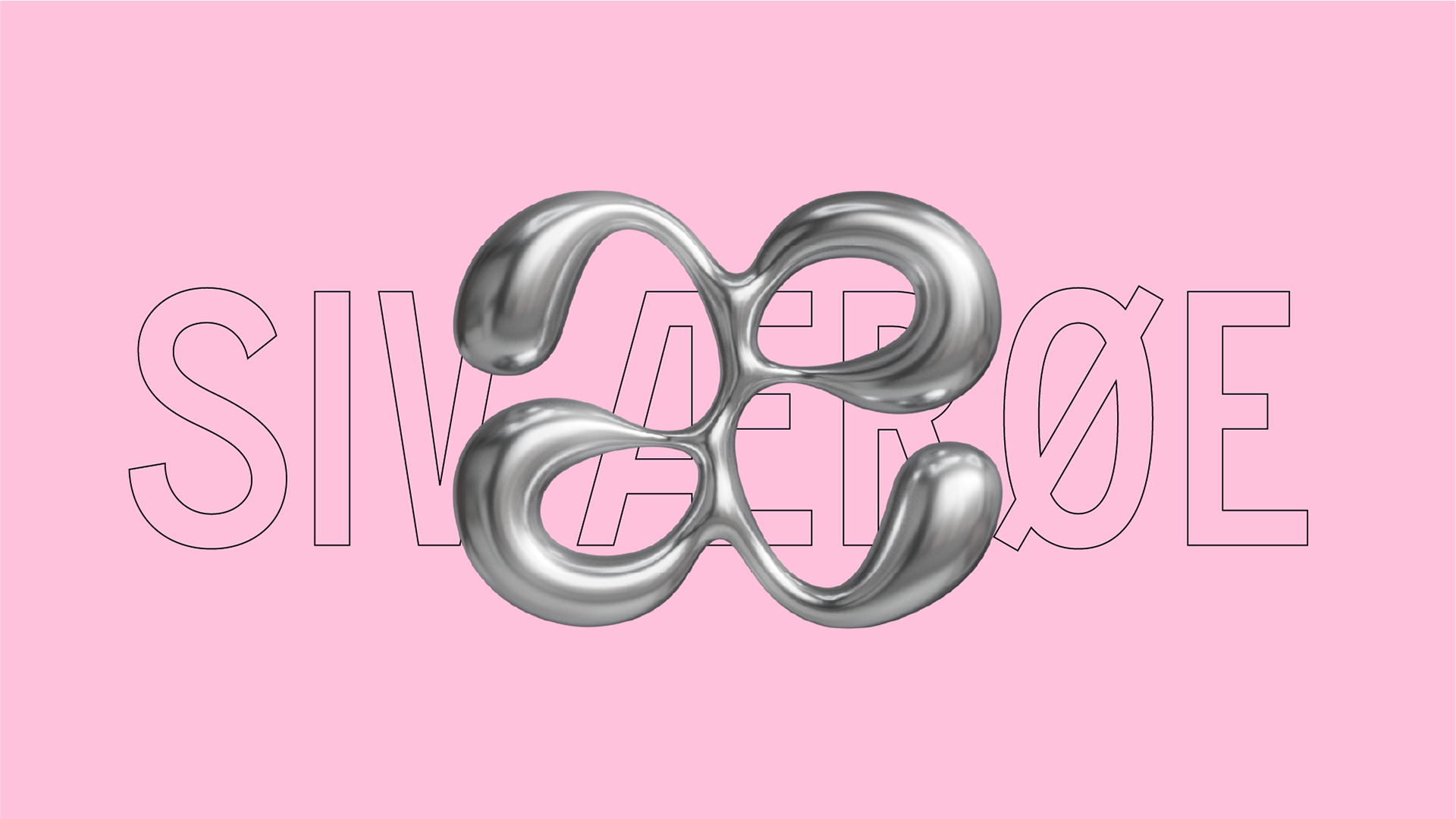
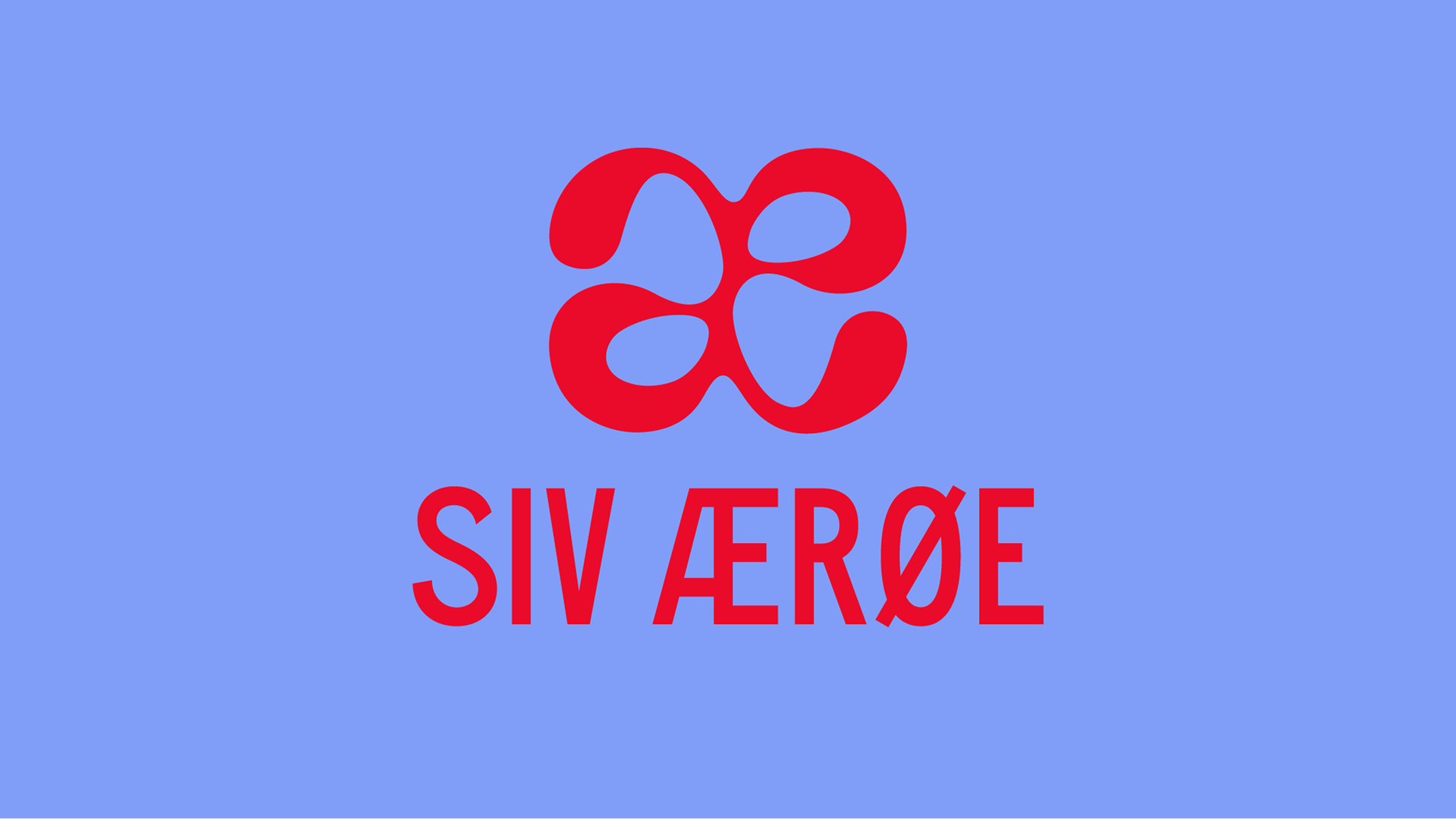
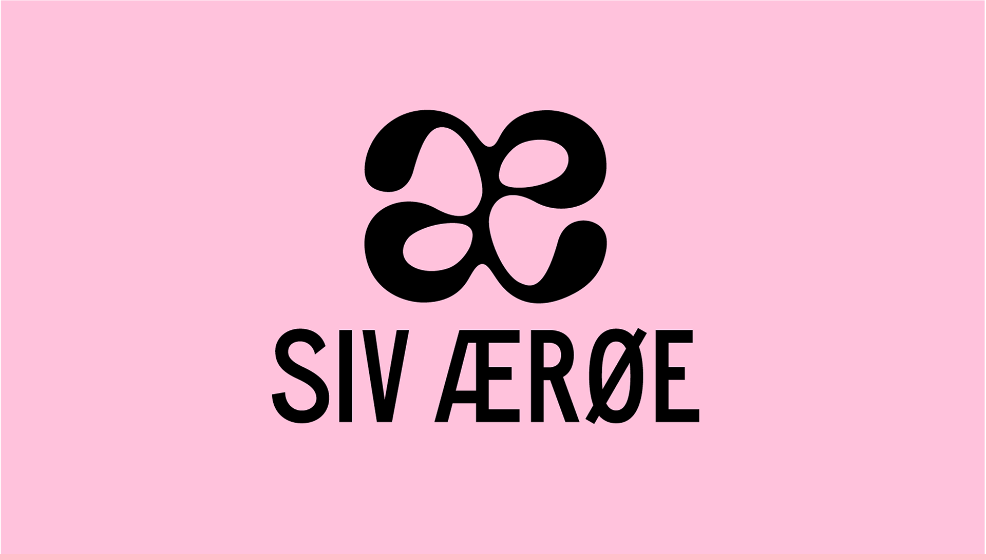
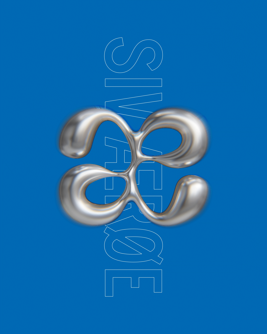
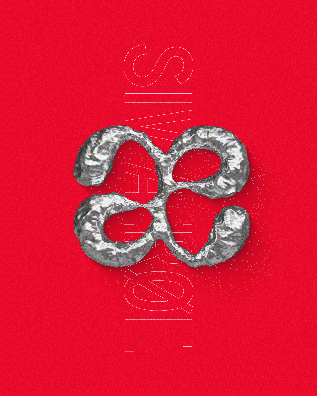
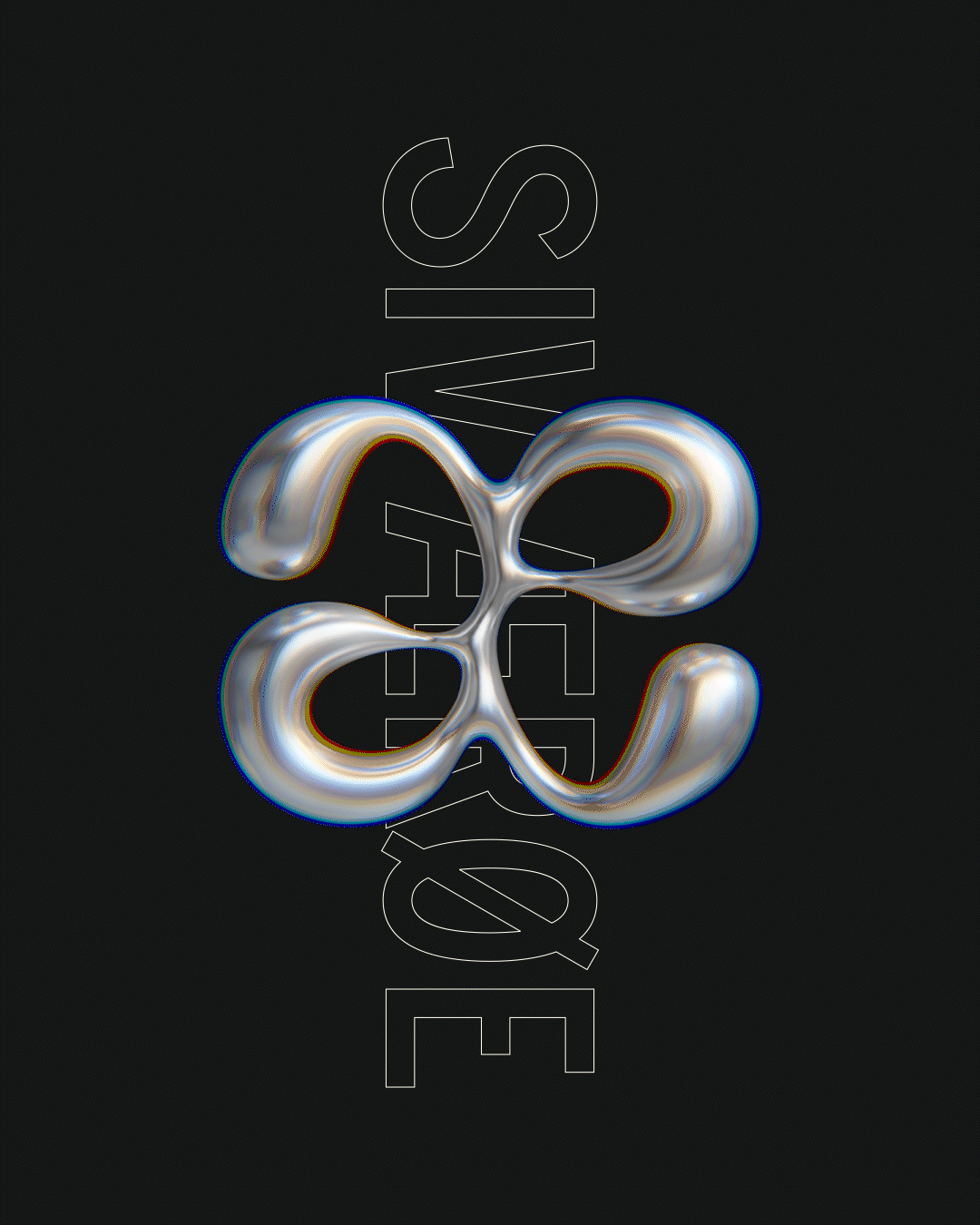
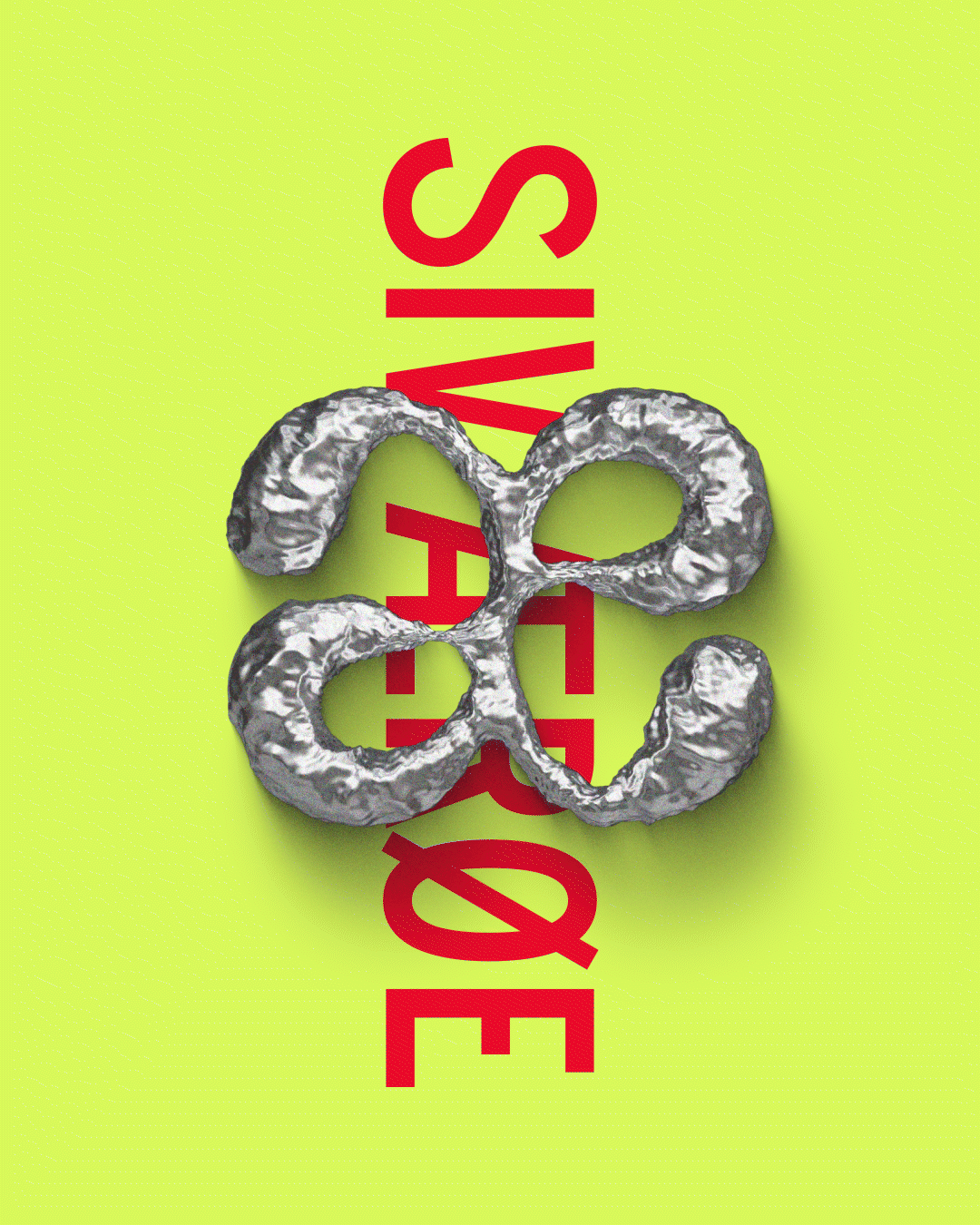
I'm very proud of my last name Ærøe, but it is not the most internationally practical name, since 50% of it's lettering is exclusively used in Denmark, Norway, heavy metal bands and "scandi-inspired" coffee shops abroad. Live, Læugh, Løve.
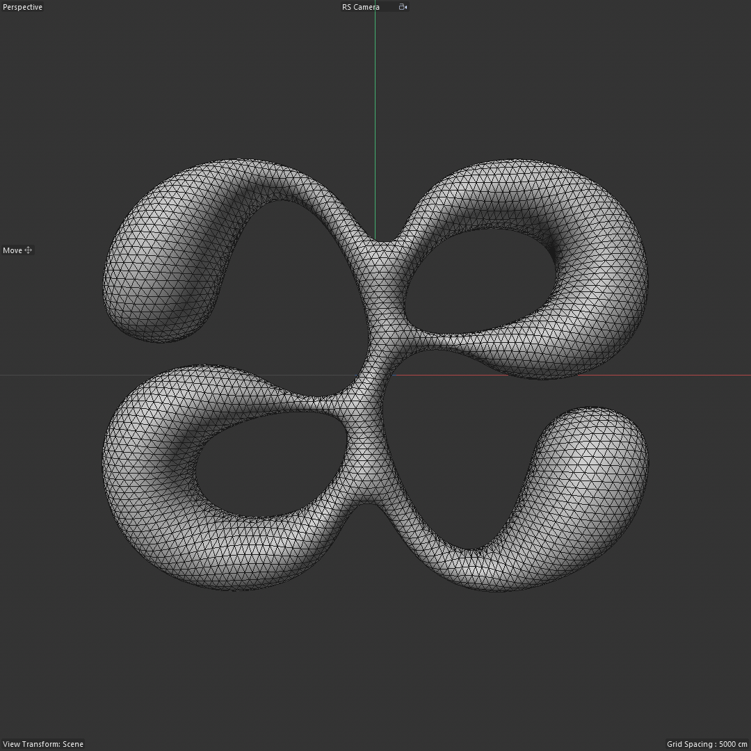
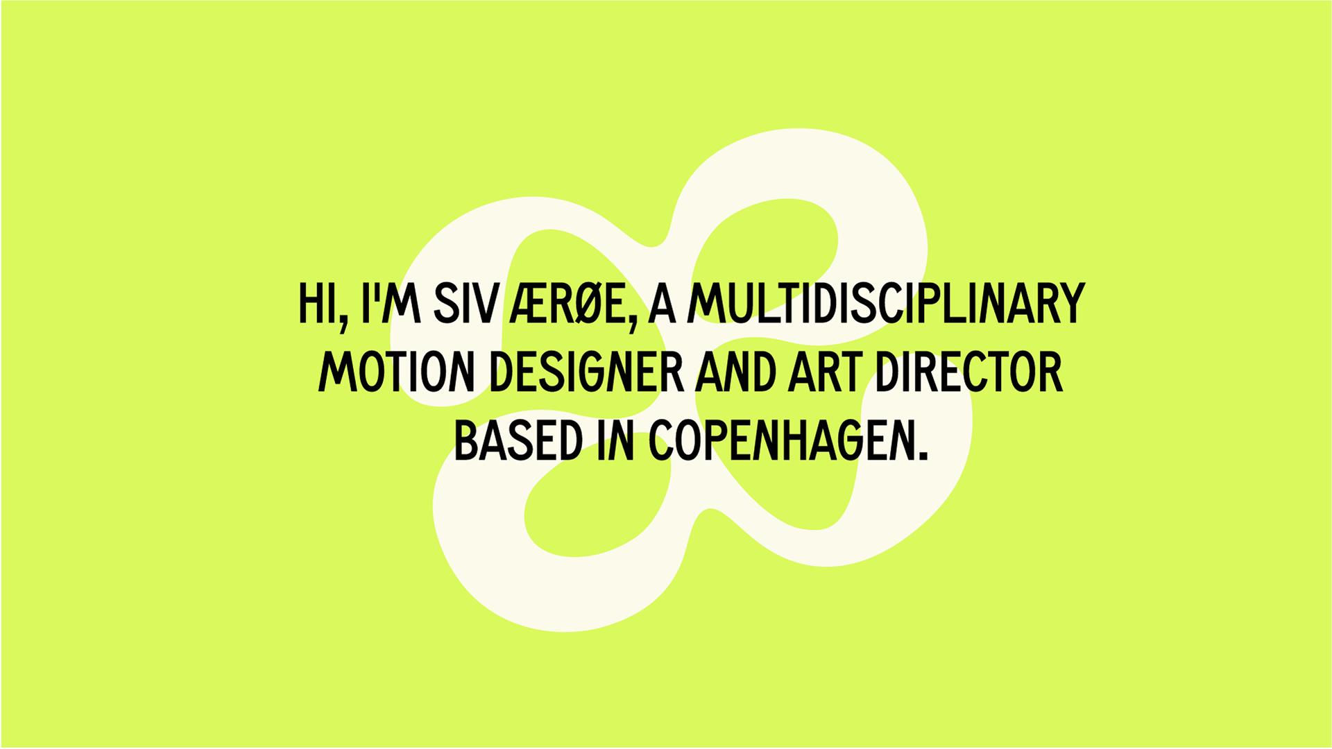
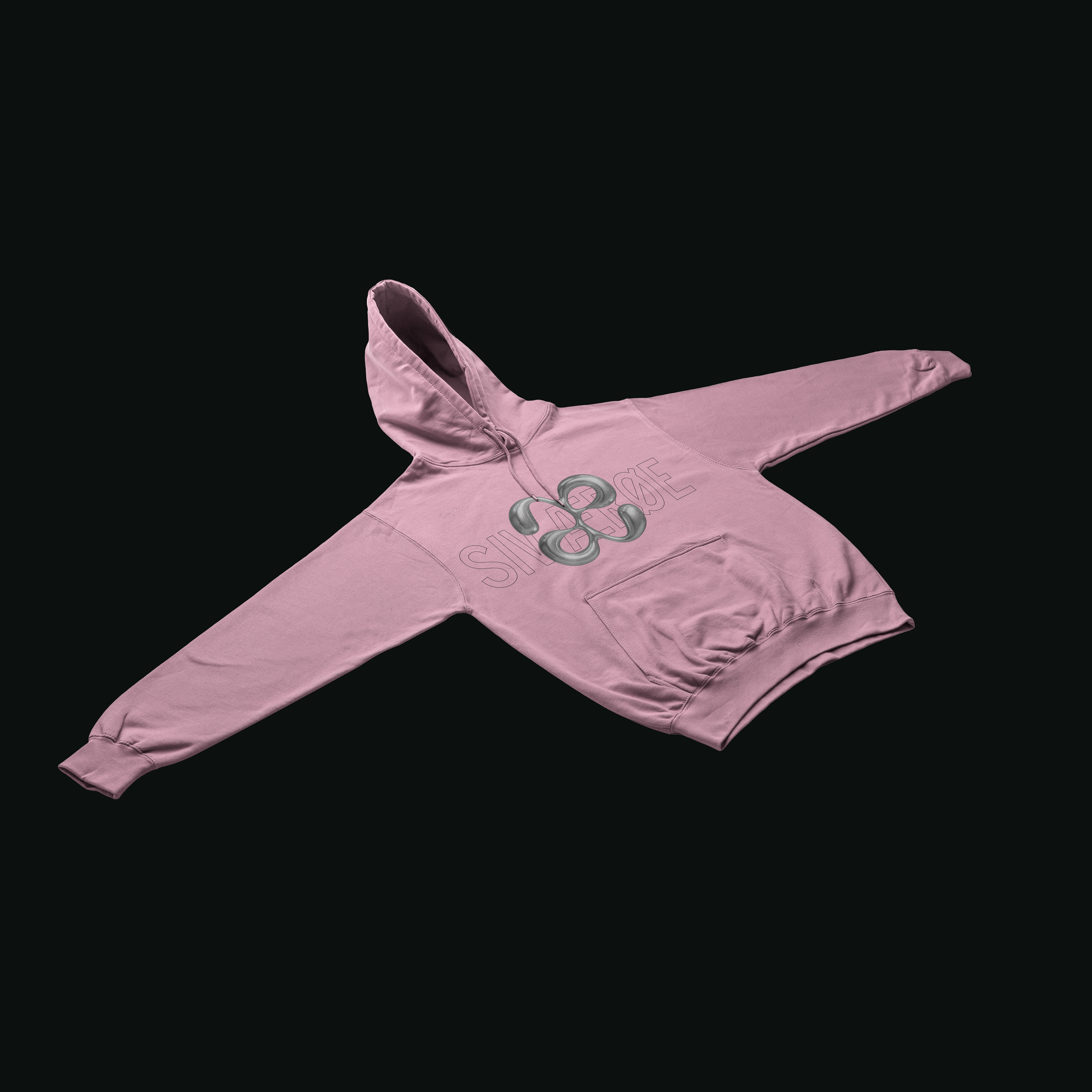
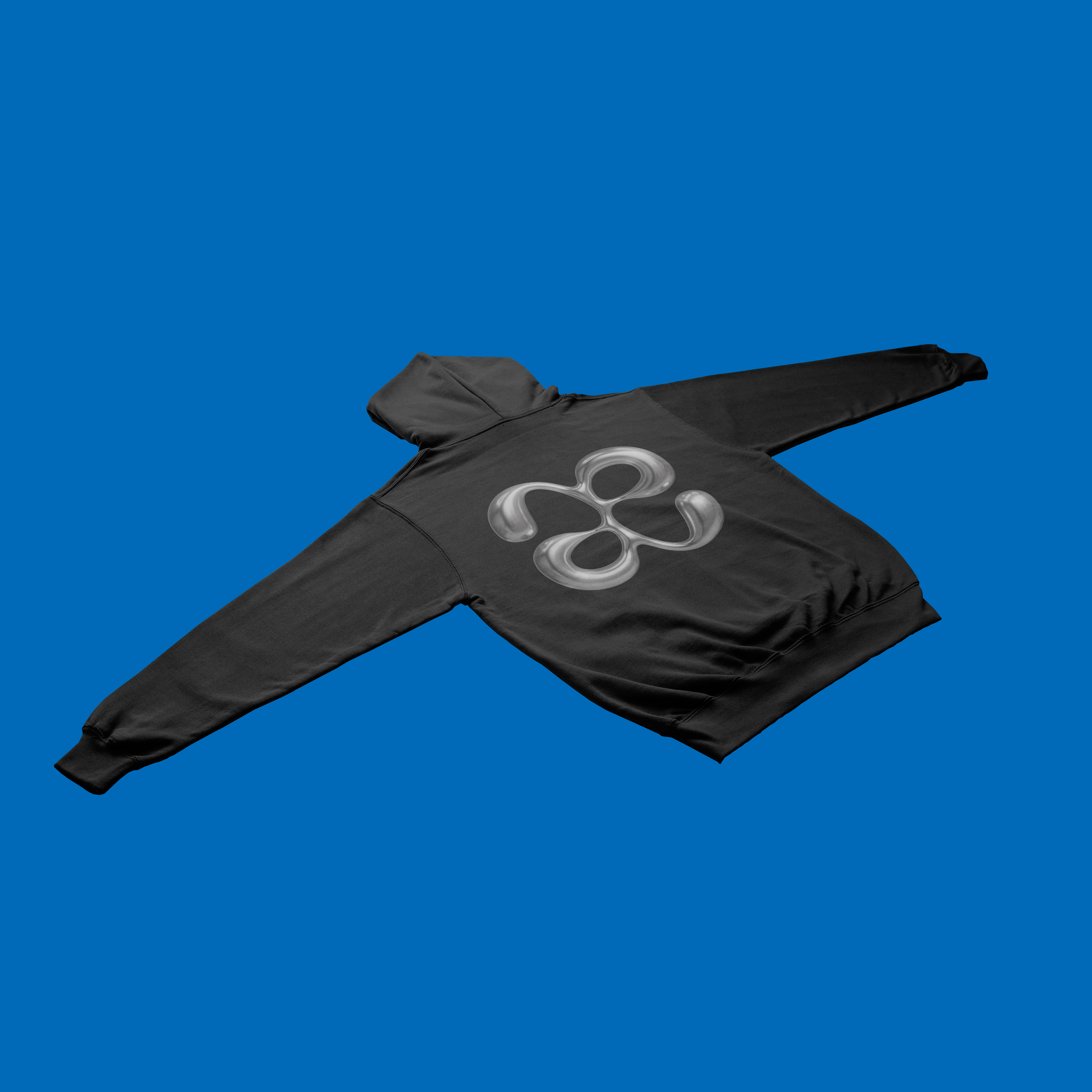
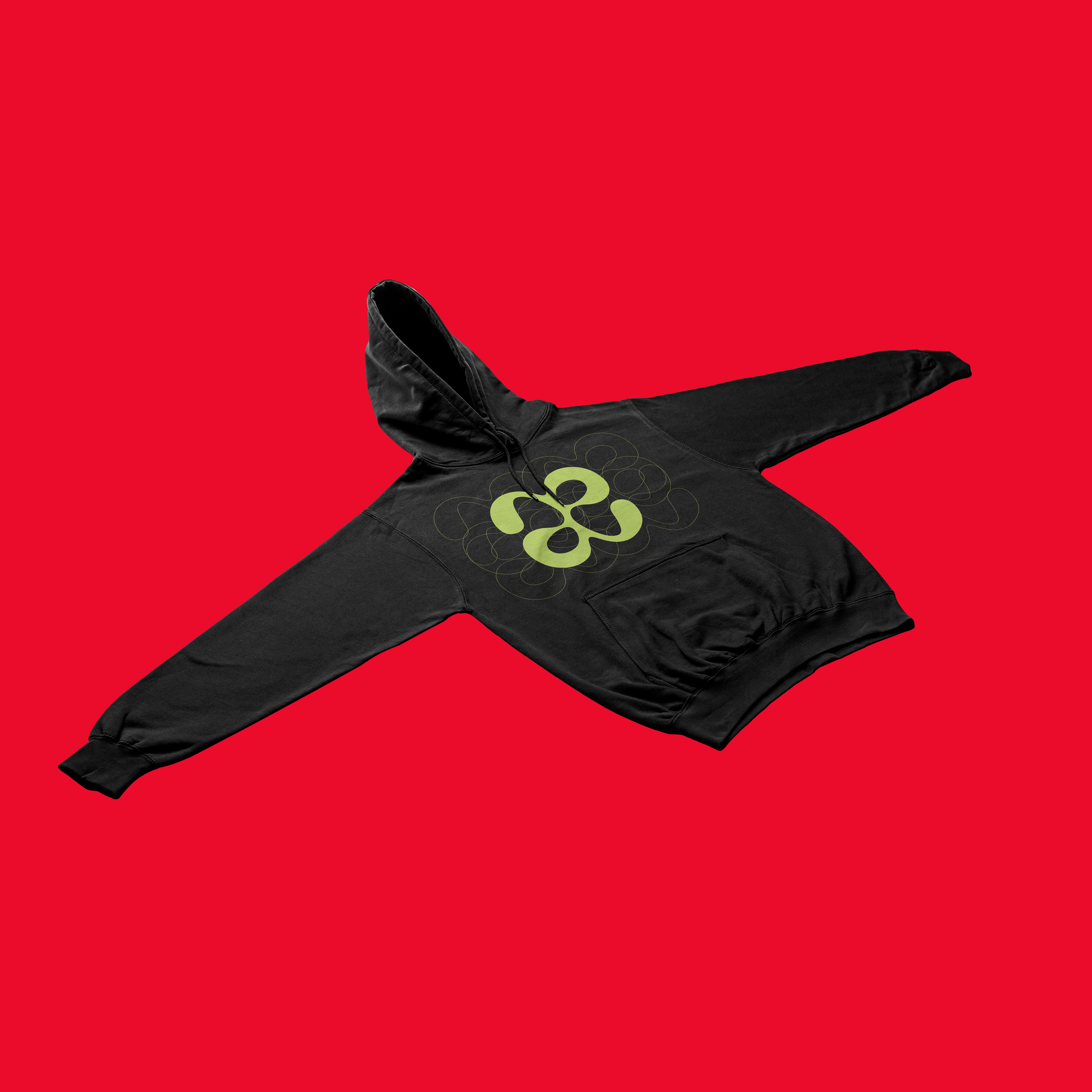
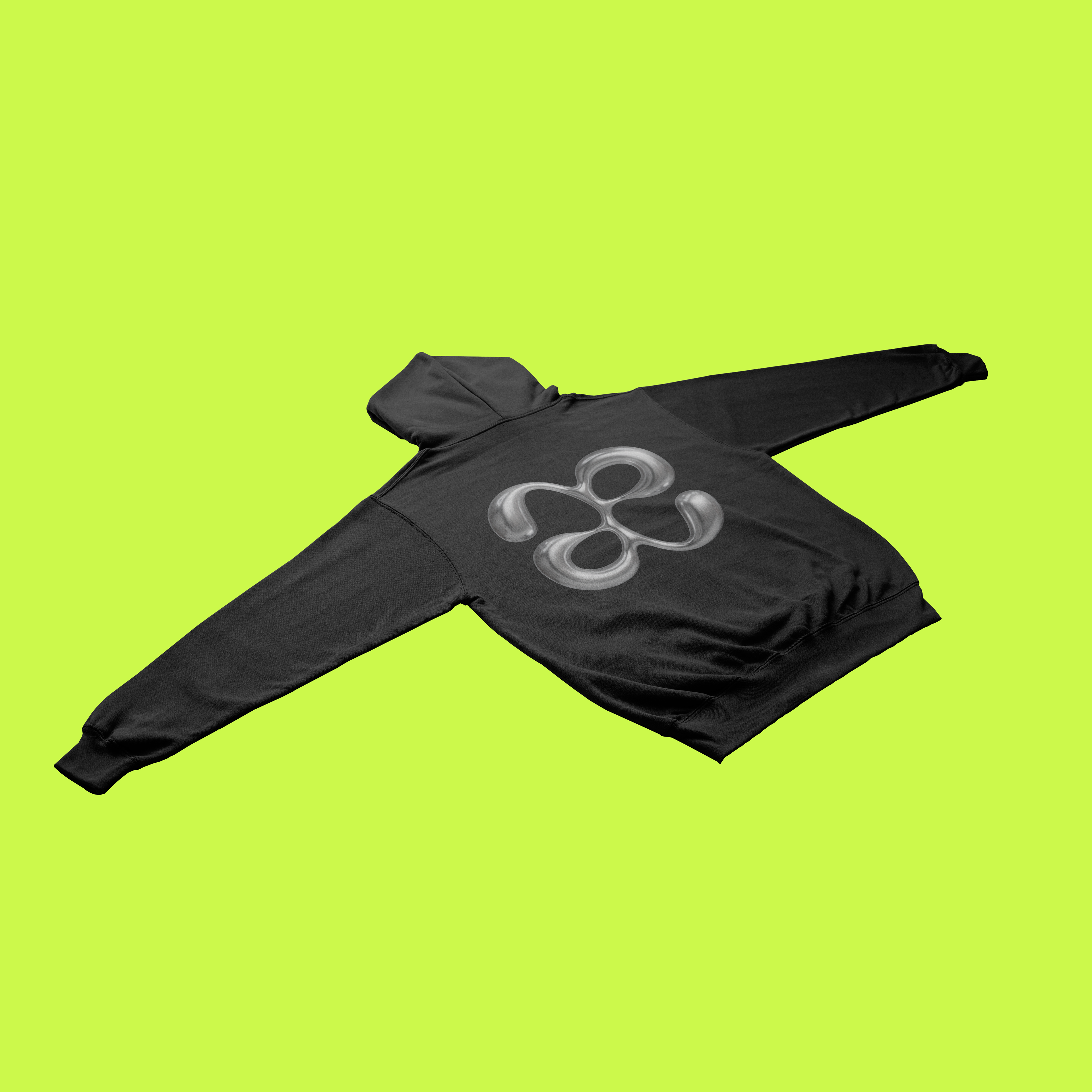
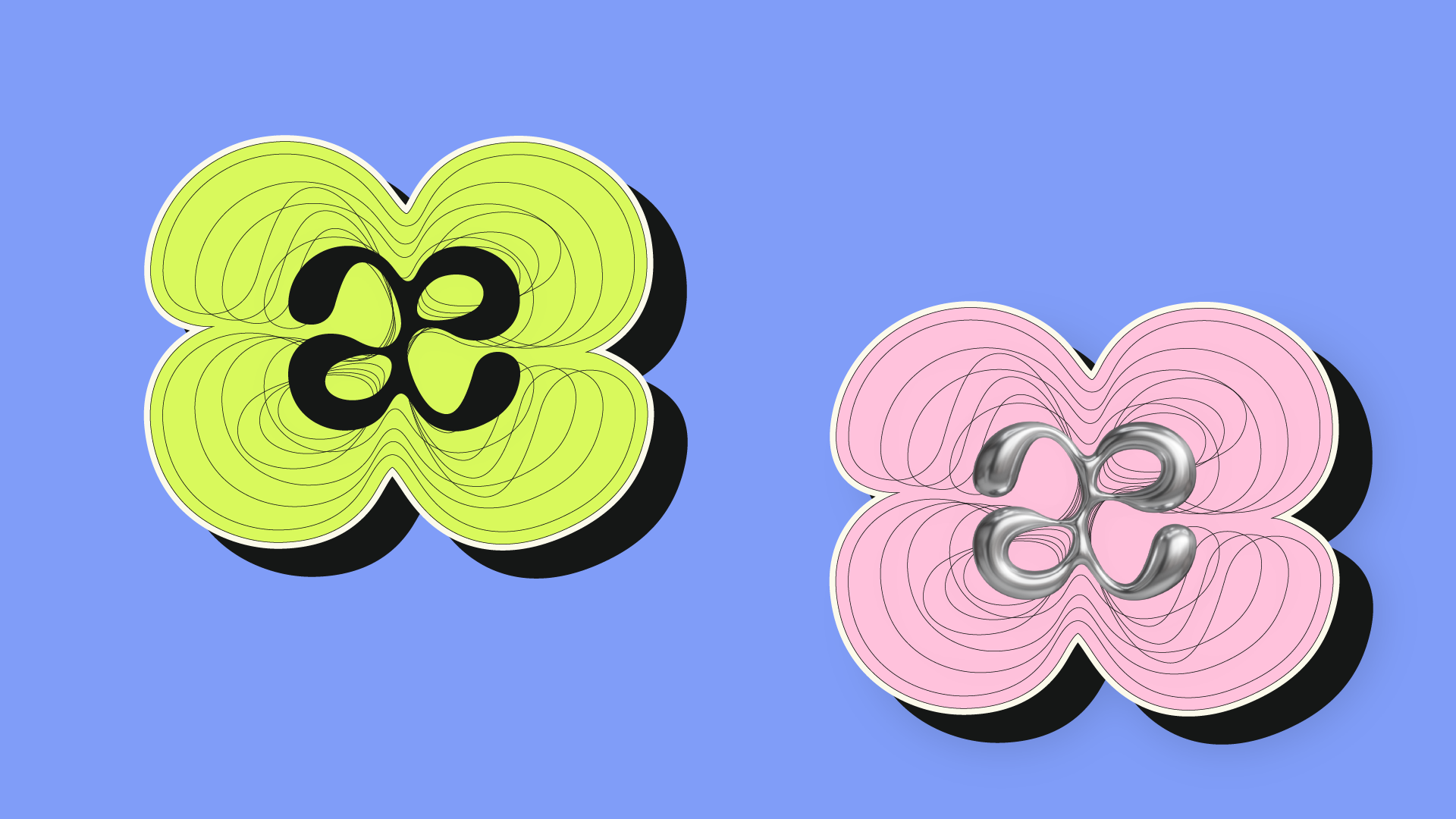
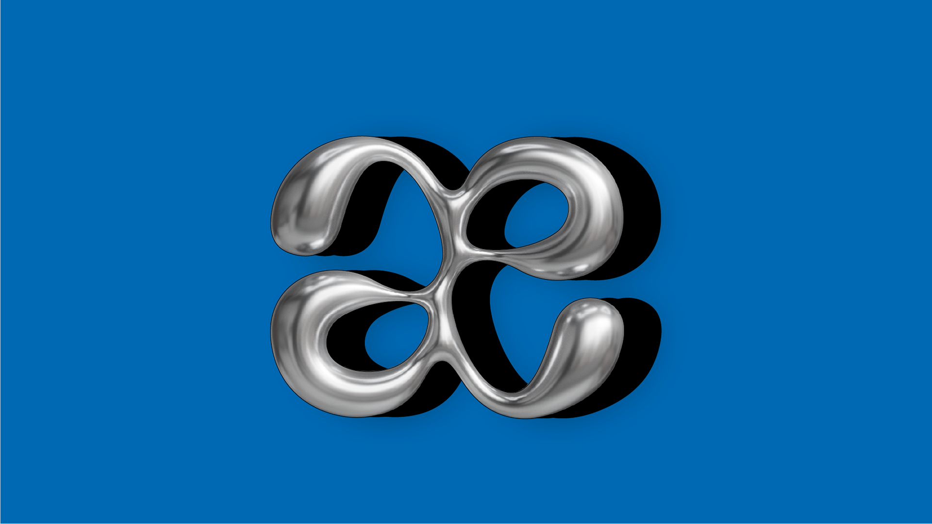
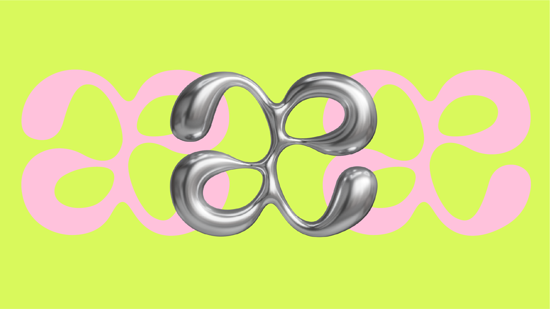
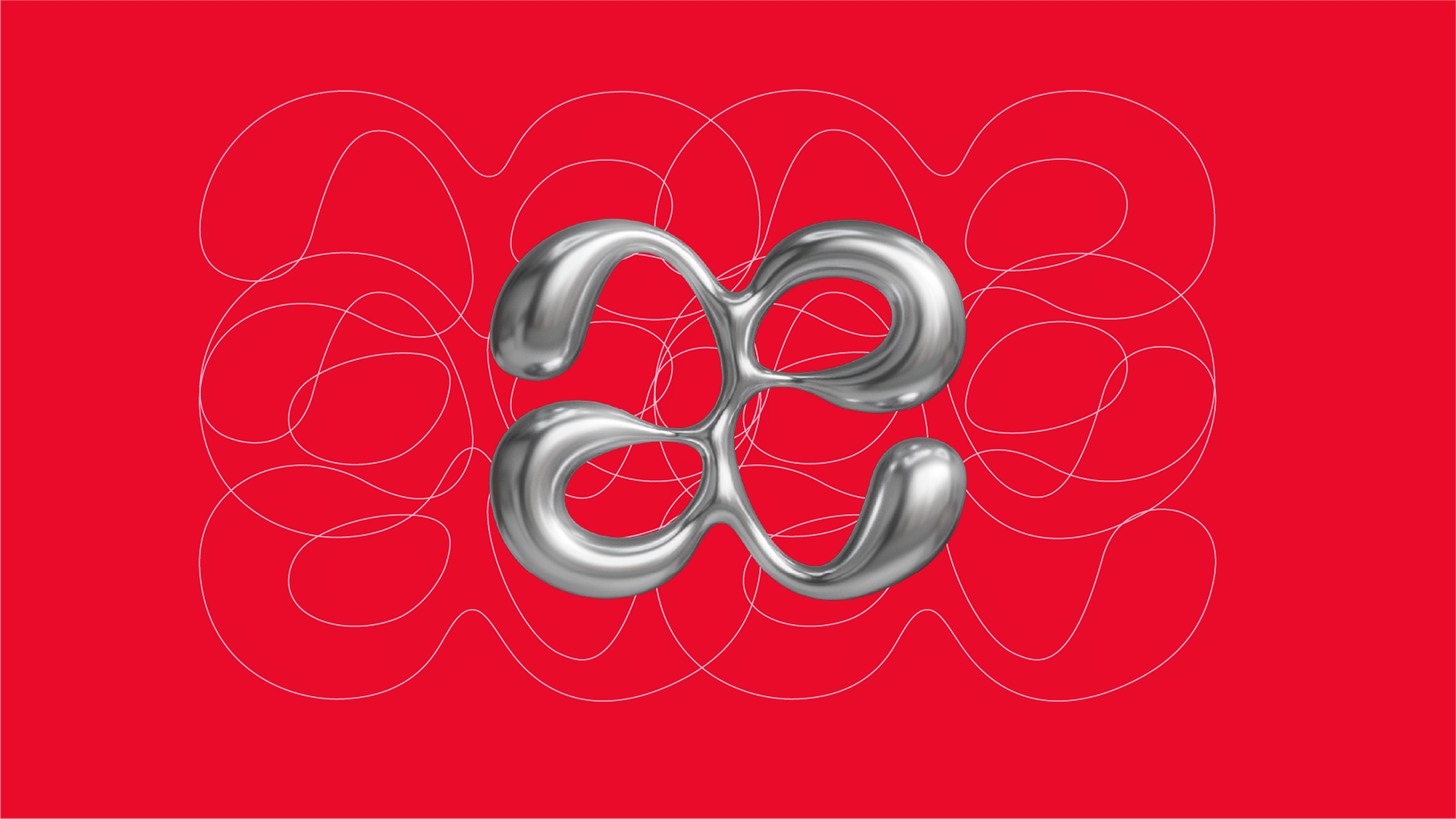
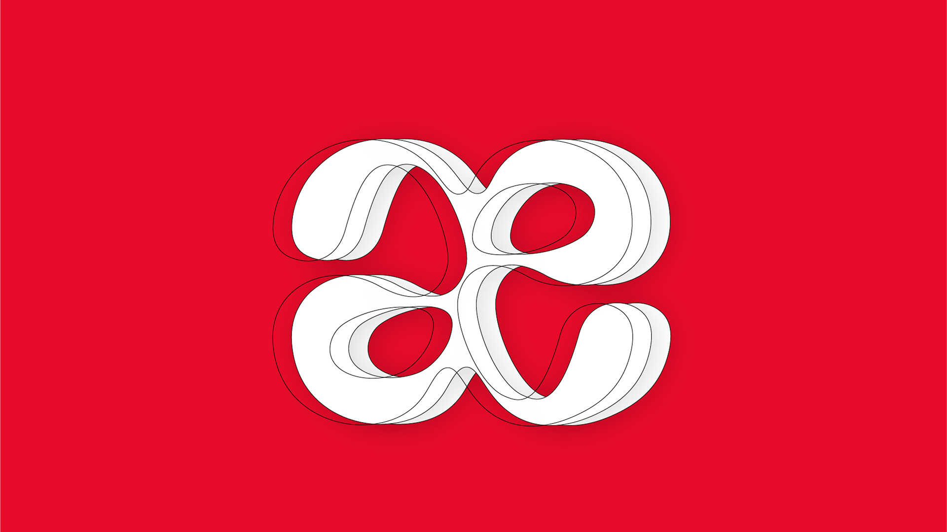
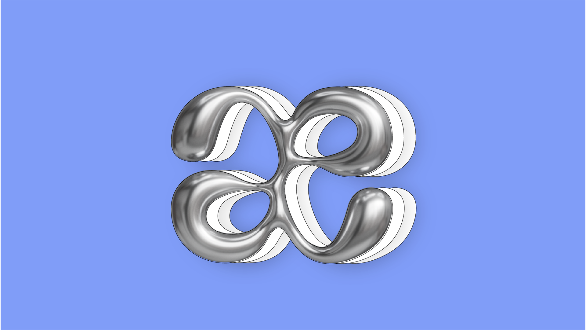
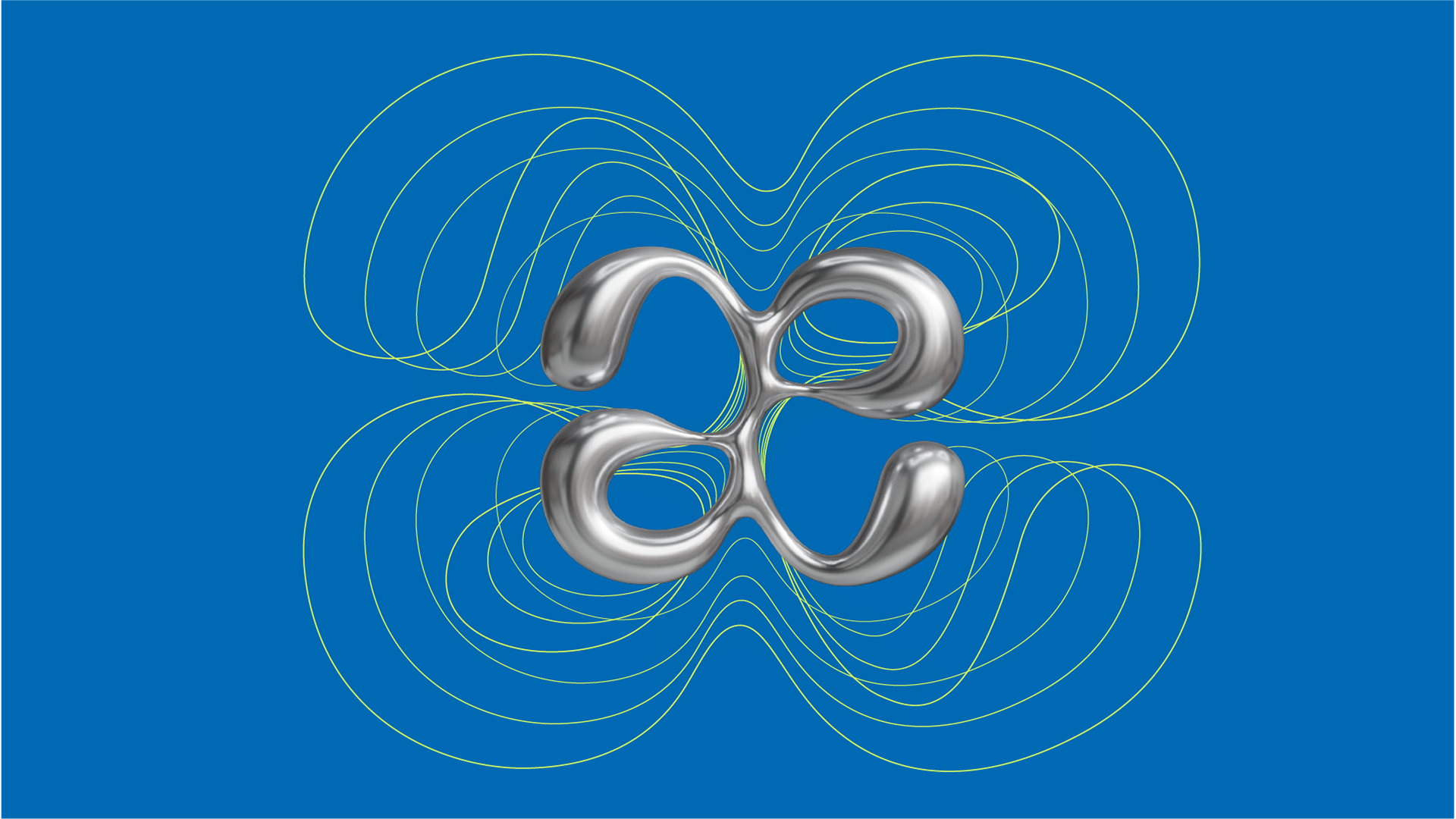
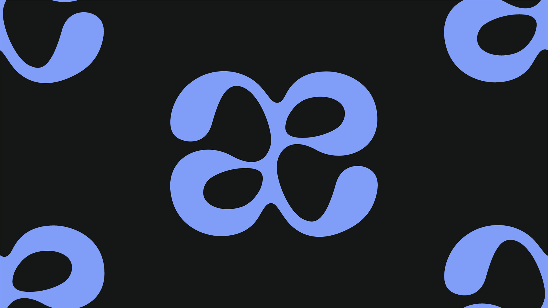
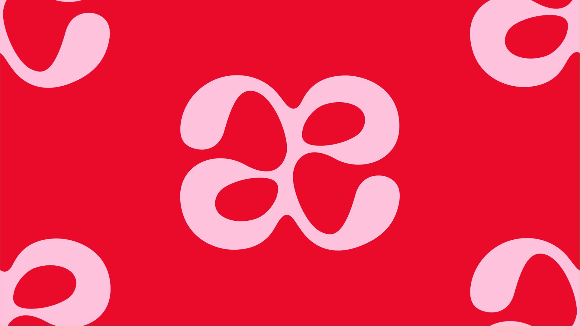
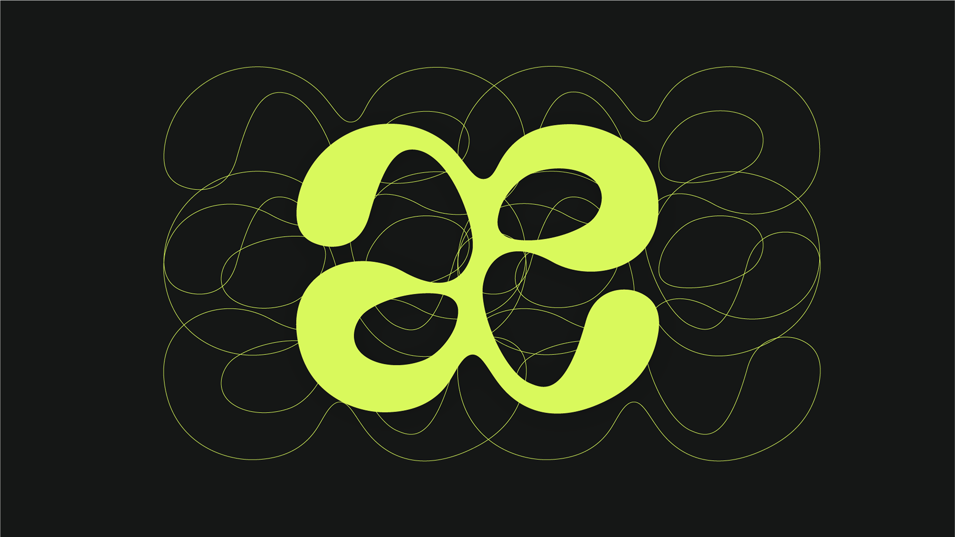
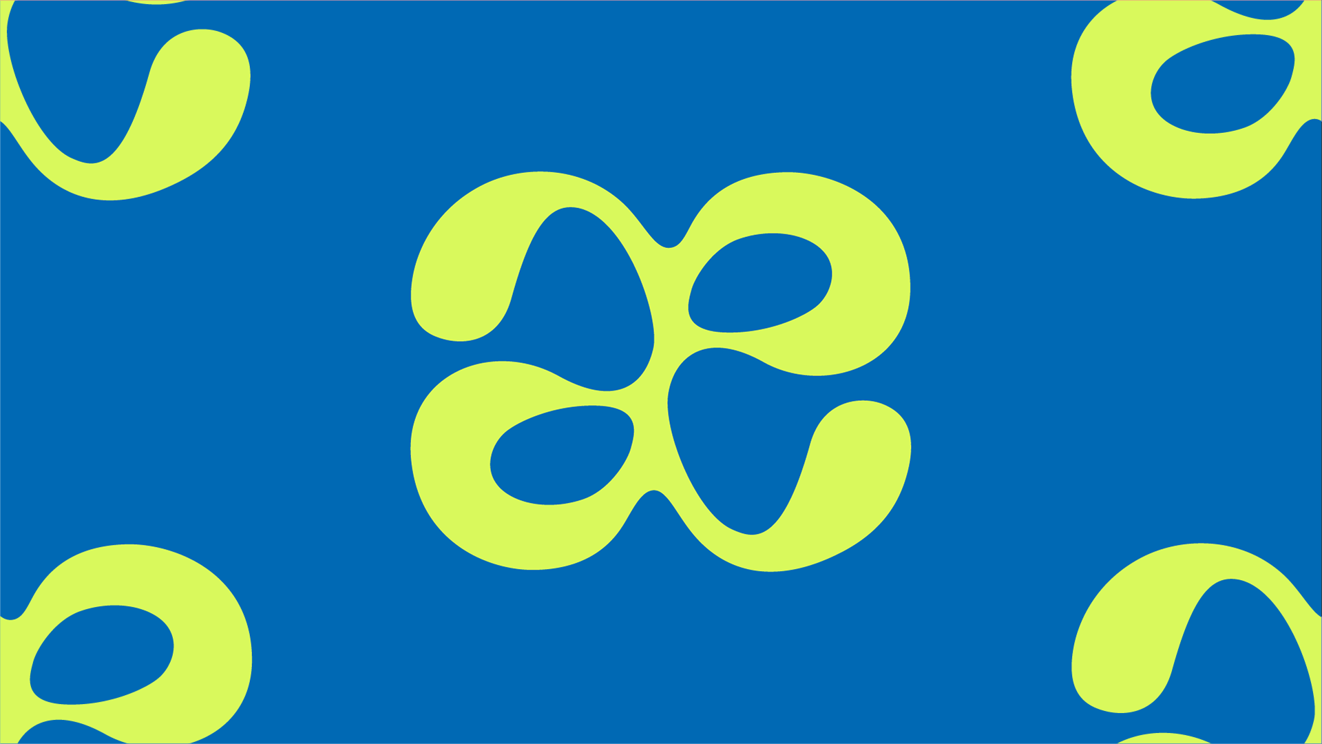
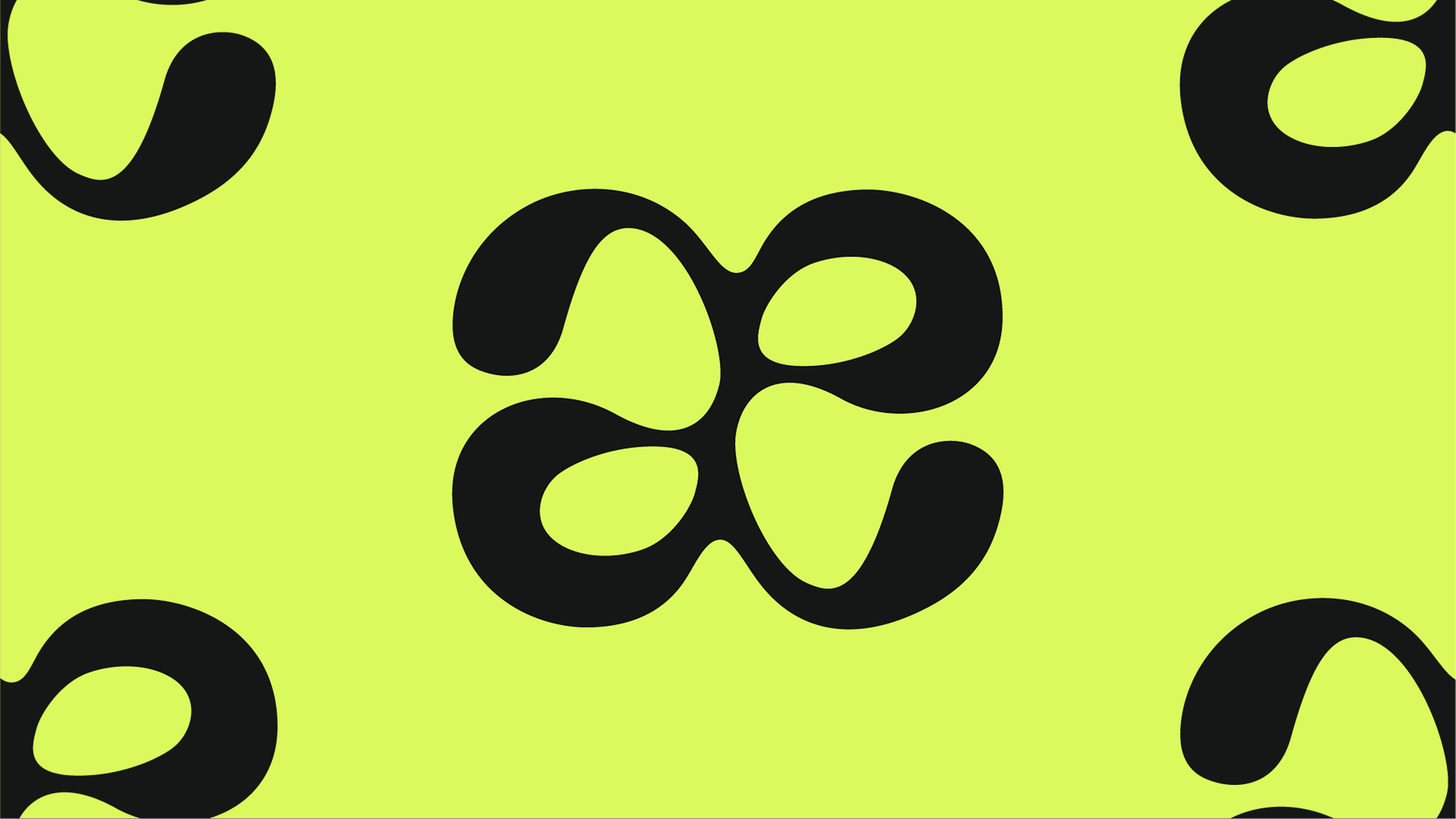
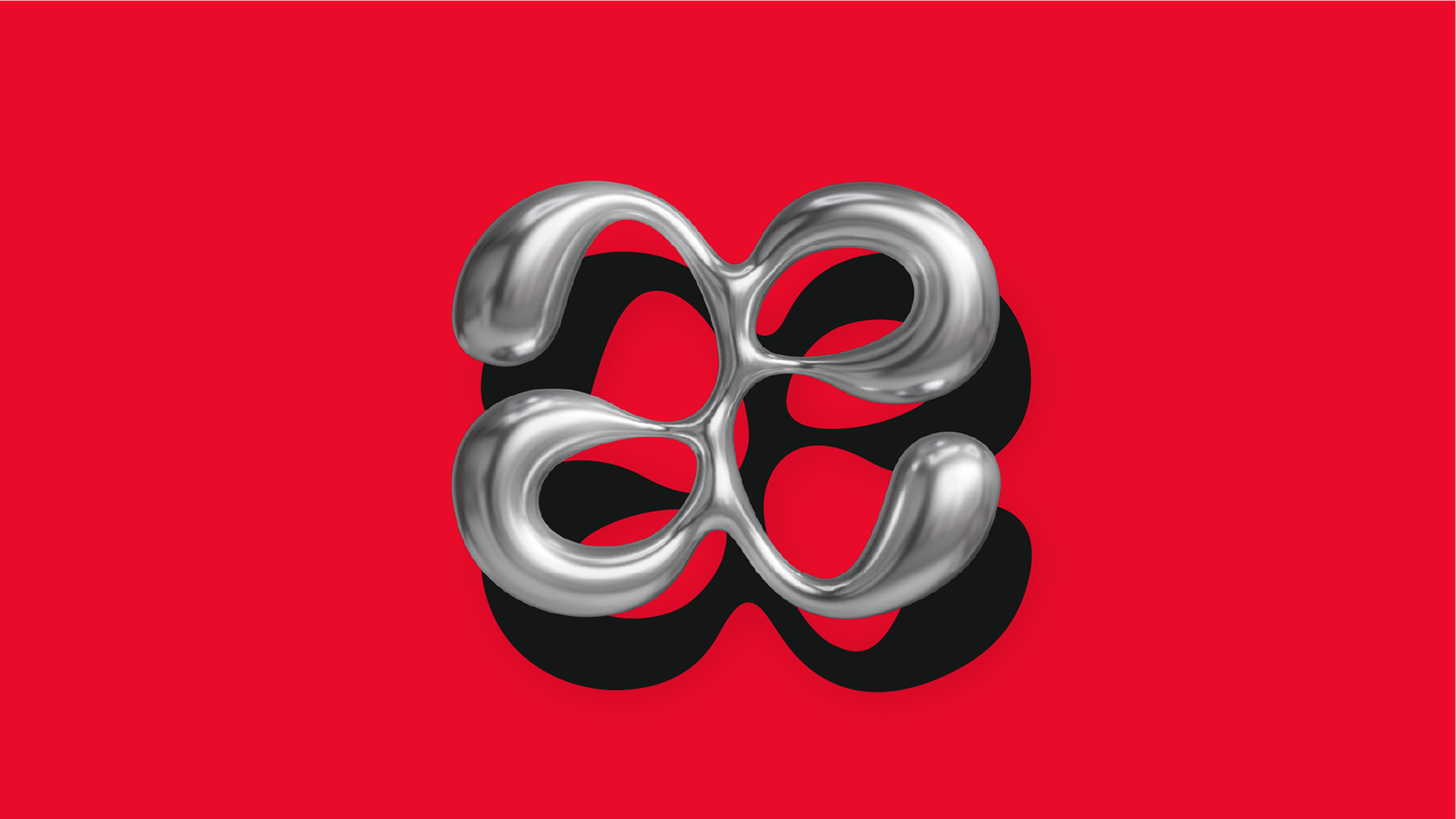
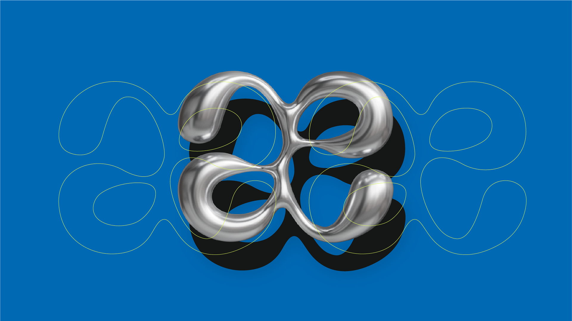
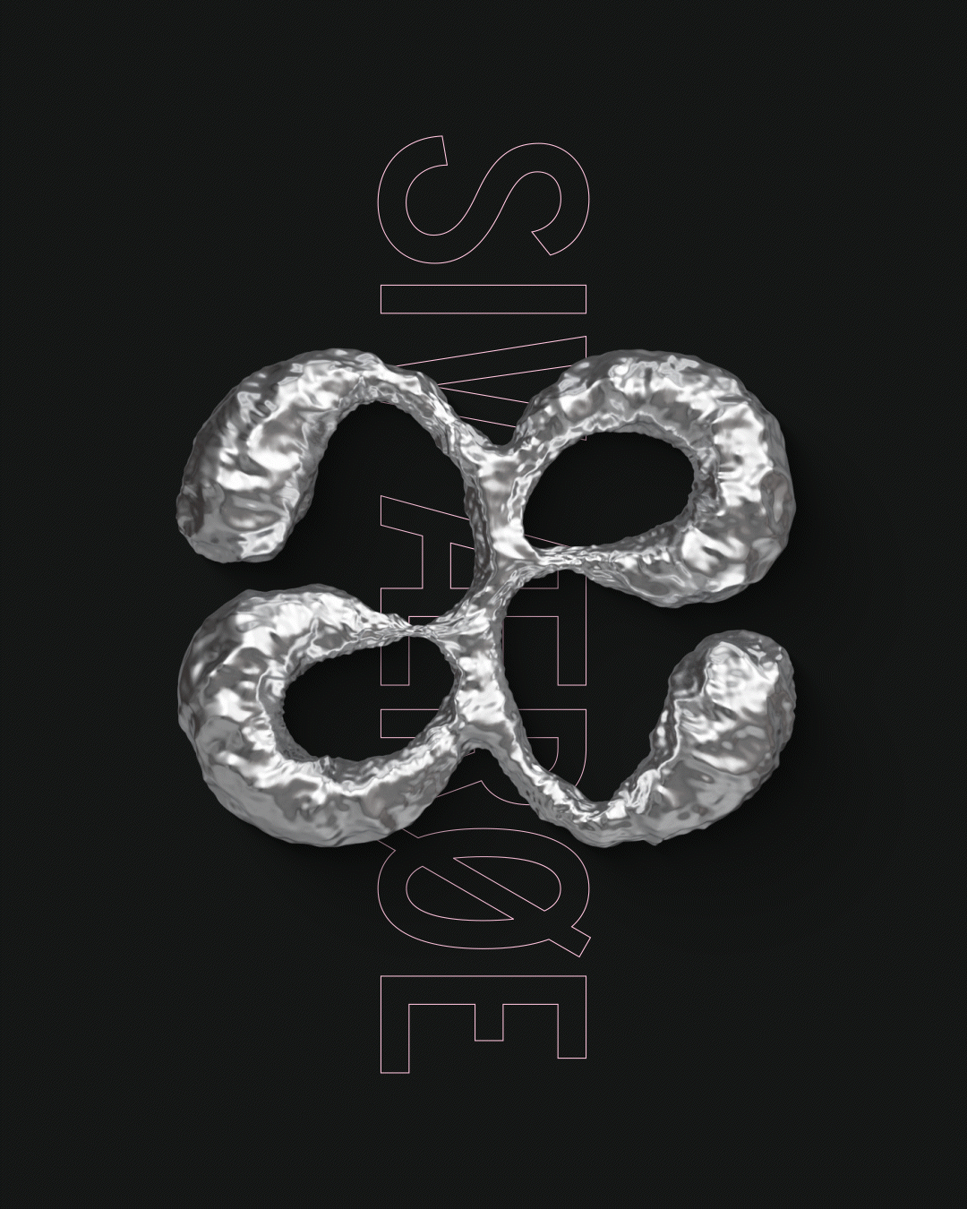
I had many trial and errors when playing around with capital Æ, but wound up seeing a lot of potential for symmetry and play as soon as I started sketching from the lowercase æ. With this, I created a fun symmetric element, which not only functioned as a logo, but also as a scalable graphic element, to be used across designs and platforms.
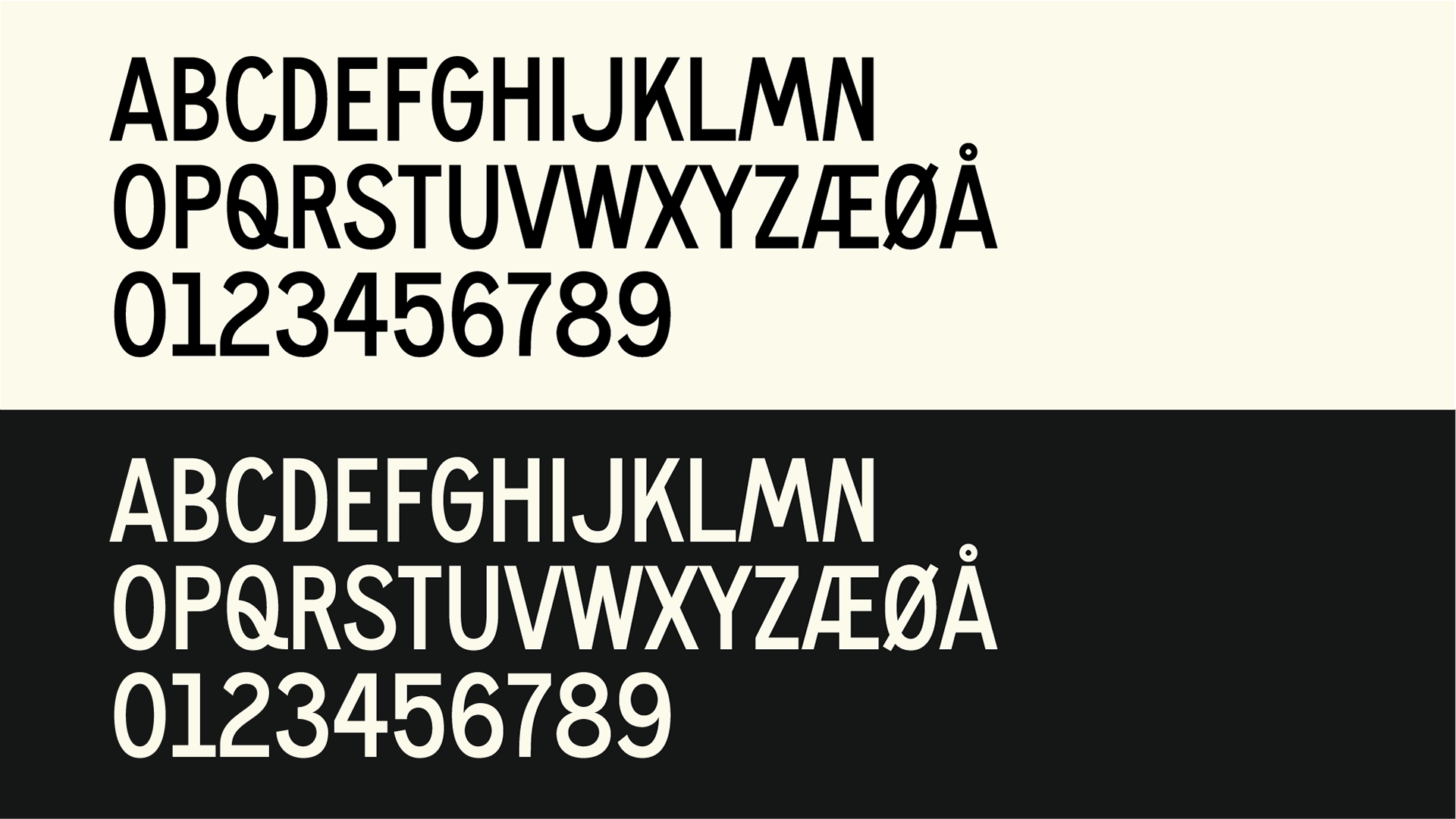
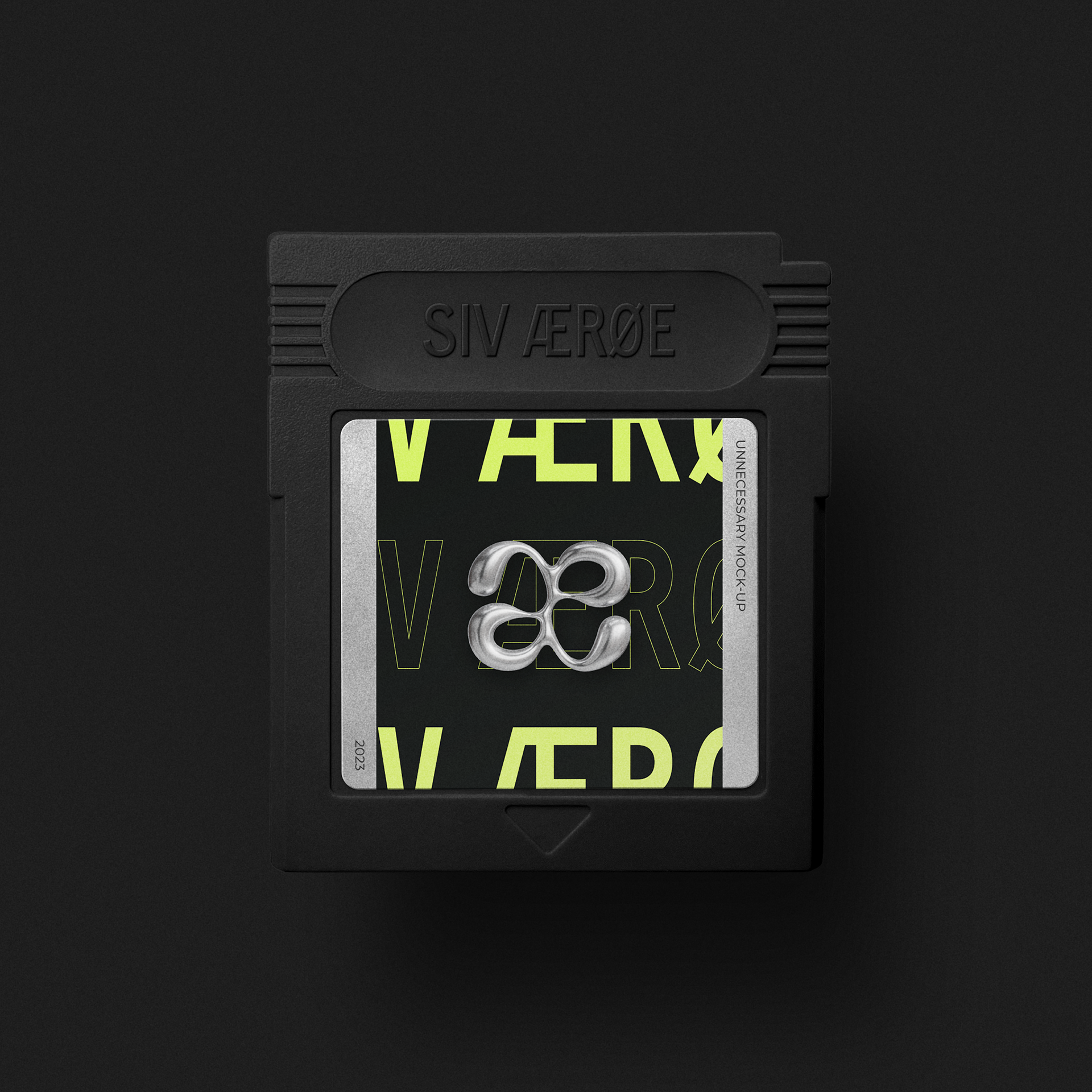
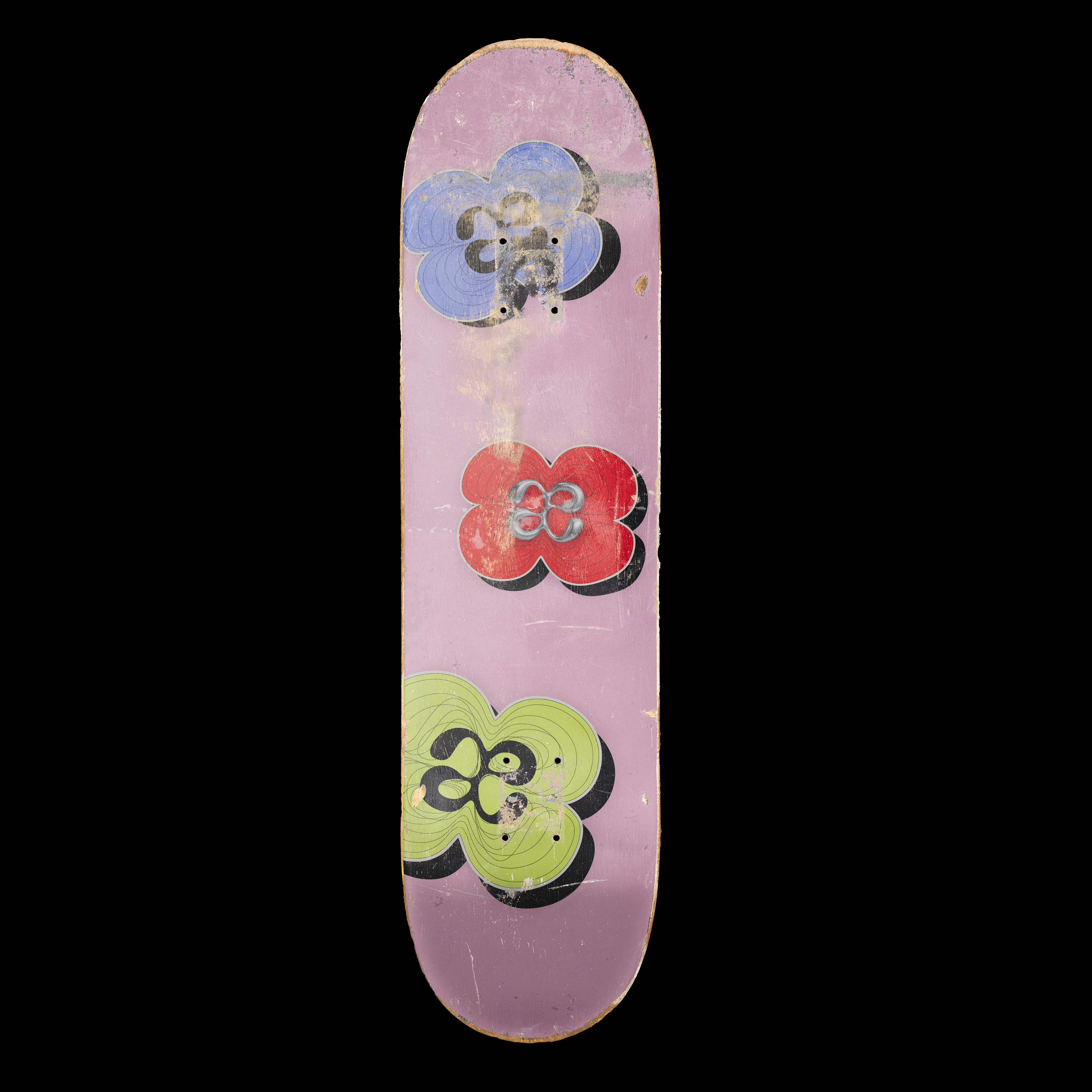
The addition of the super fun playful, yet powerful VTC Carrie, strengthened the identity significantly and I'm really enjoying adding it to my vast collection of unnecessary mock-ups.

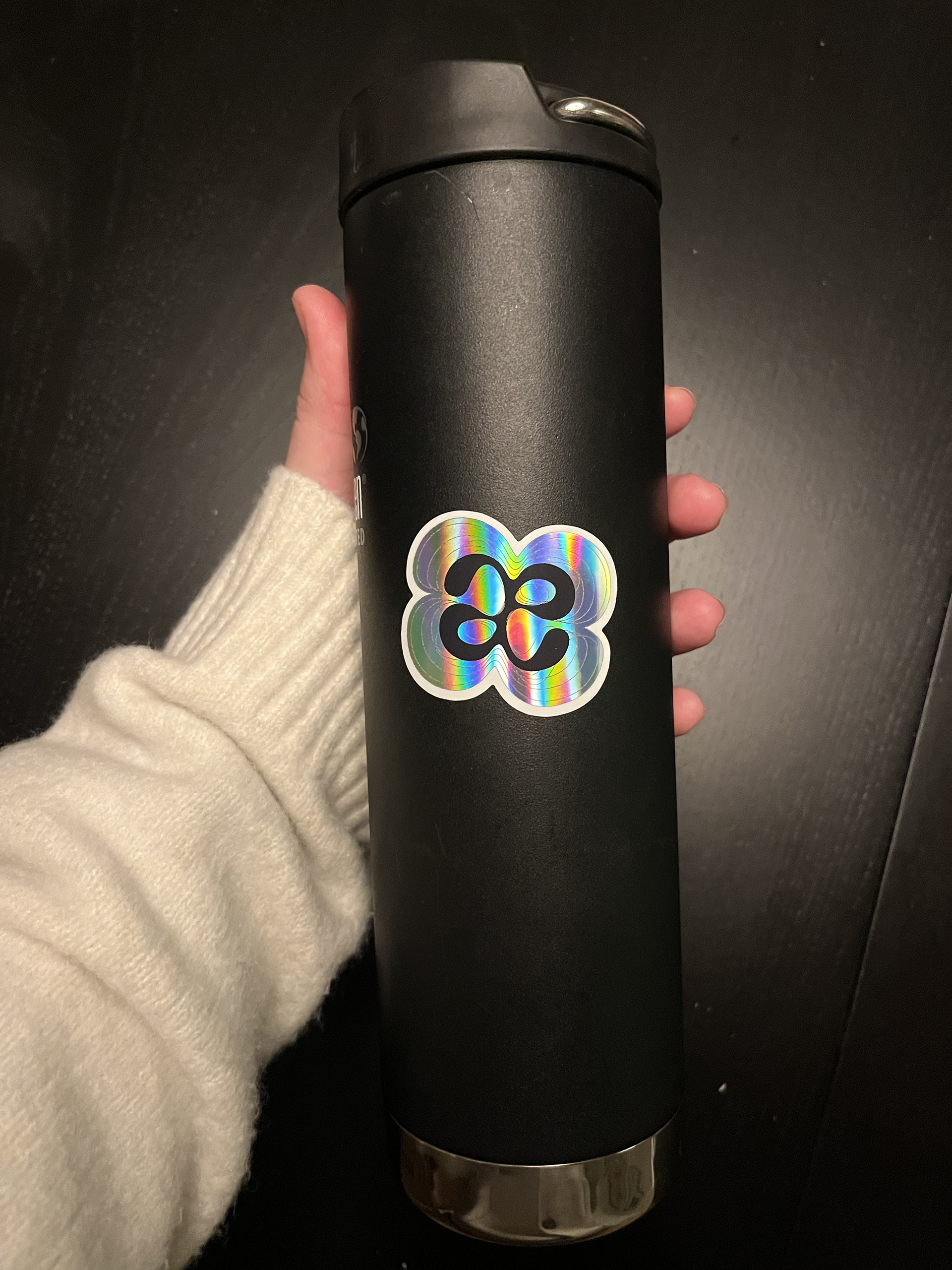
Repped by my thermos
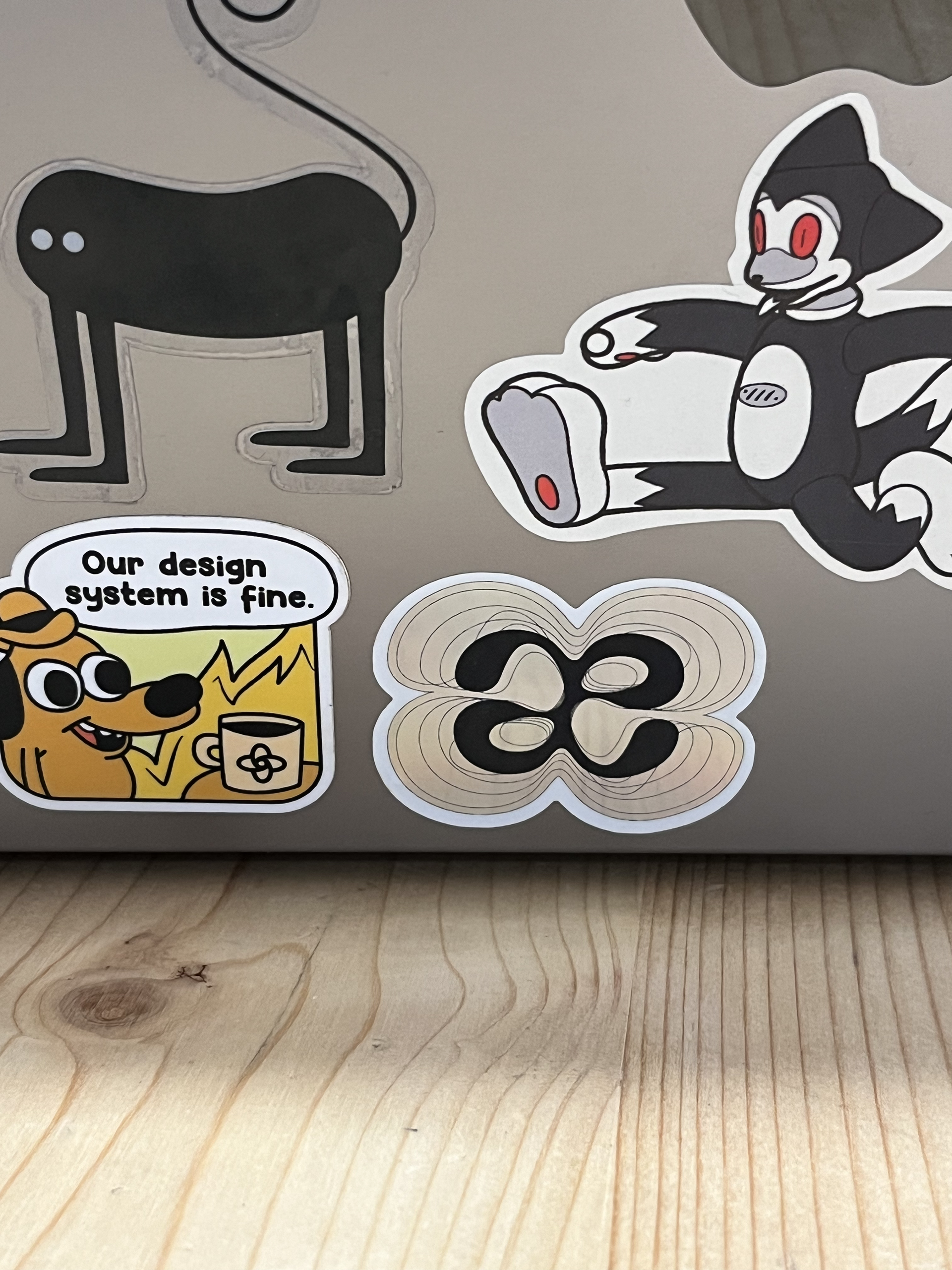
Repped by my lovely co-workers